My methods
I have seen the benefits and drawbacks of most technical analysis and trading methods available and I am going to use the following techniques:
- Volatility contraction, using Bollinger Bands for breakouts from consolidations
- RSI divergences for reversions
- Moving averages for long term turning points
- Breadth indicators for identifying turning points, in particular for long term turning points
- Market cycles for some long term context
- Performance ranking as a way to corroborate RSI divergences
Markets move between times of high volatility and low volatility. Often, a trend starts from a period of low volatility: a trading range, base or top. I will deal with the reversionary situations in the section on RSI divergences.
Volatility can be shown by Bollinger bands. When the bands pull close together this is a low volatility market. Eventually, the band width will expand as price moves.
I look for low volatility set ups on raw price and on pairs, often a stock versus an index. These are on weekly charts, I am looking for volatility breakouts that could last for months.
Criteria for Bollinger band breakout trades
- Look for bands that are as tight as they have been for the last 3 years
- Entry signal is an expansion of the bands and a weekly close beyond the bands, trading in the breakout direction
- 14 week RSI is mid range (40 to 60)
- Stop loss is a move back the beyond the consolidation that preceded the original breakout
Example: IBM in September 2010

Additional criteria/ clues
- The more time since the bands were as narrow, the better
- Ideally bands should contract with a steep gradient then break out soon after
- Consider whether the moving average (same period as the bands) is rising or falling to help predict reversal or continuation
- Use other ideas on this page as supporting evidence
Example: McKesson Corp (MCK) versus the S&P 500 Index
This example shows the idea of band width contracting steeply and then breaking out quickly.

Often, bands can just drift together and there is no decisive resolution, whereas the above situation is more tightly defined and resolves decisively more often. Views on whether this matter differ though and all of the ideas described here can be tweaked over time.
Divergences on the 14 week RSI (Relative Strength Index) have marked many important market turns over the last 10 years.
The latest example on the S&P 500 Index came at the 2009 low, where price made a new low but the RSI held above the late 2008 lows whilst still below 30 (the oversold level).
Example: S&P 500 Index at 2009 low

There was another divergence formed in November 2008 and whilst this marked a pauses in the downtrend it did not end it. This is something we have to be aware of with divergences.
There can also be reversals arising from divergences on the daily RSI but weeklies are more reliable so I will focus on them. I will look for divergences on price and on ratios, usually of a stock against an index.
Criteria for divergence trades
- Weekly divergence on the 14 week RSI
- Observe a shallower gradient of the price/ relative and the RSI line
- Daily RSI divergence beforehand that fails to hold the decline
- Another Daily RSI that is divergent but above 30 or below 70
- Ideally, weekly and daily MACD divergence
- Entry signal is a weekly close of the RSI above (or below for tops) the intervening high
- At times, a weekly bar reversal can be taken as an entry signal. This will depend on other confirming factors
- Stop loss is a move back into oversold or overbought (30 or 70) on the RSI, or a weekly reversal, decided at the time of entry
Example: Amex Biotech Index (BTK) versus S&P 500 Index
The weekly chart shows divergences in June 2011 and December 2011 that proved to be good signals.

Daily ratio chart

- In December, the low comes with RSI above 30, with the November divergence not having held the decline
- In June, the high is formed with RSI fractionally above 70. Tighter criteria means some trades get missed
- In February 2012, a daily divergence is formed, without the weekly RSI reaching overbought. I use daily divergences to close positions but not to enter them
A moving average crossover method works as follows:
- When a short period moving average crosses above a long period moving average, that is a buy signal.
- When a short period moving average crosses below a long period moving average, that is a sell signal.
This method works with markets that have trended but not in sideways markets.
For example, the arrows below show this on the S&P 500 Index for a 13 and 34 week. Although this worked well for a while, false signals are given in 2006, 2010 and 2011.
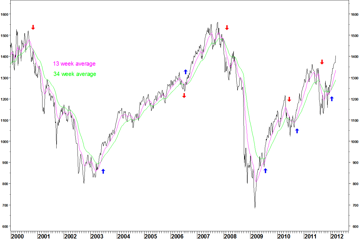
Criteria for identifying moving average crossover opportunities
- The averages must have had a long time since their last crossover. This will be at least 2 years, preferably 4 years
- There must be a divergence on the MACD indicator. This shows a weakening of the trend
- Preferably, other methods described here should offer supporting evidence
These opportunities will be looked for on raw price charts but probably more examples will come from pairs charts.
Example: Walmart (WMT) versus the S&P 500 Index

- The chart shows a 30 and 40 week moving average combination
- In January 2008, after a 4 year decline, a buy signal is given, for Walmart to start outperforming the index
- The sell signal is given in August 2009, a long way below the peak
- To counter this problem of late signals, we can look at the MACD indicator. That showed divergence in March 2009 at the peak as was a warning signal
- There are more divergences than turning points (see 2004 – 2007). They must be considered alongside other evidence from the other ideas described here
- Some crossovers fail. The October 2011 crossover has led to a rally. Like divergences, they must be considered alongside other evidence
Breadth indicators show the proportion of stocks that are ‘going up’ according to a set of defined criteria, which can be varied. They aim to show the level of stock participation in a market or sector index move.
High breadth in a rally ‘confirms’ the index move but what often happens at market peaks and troughs is that a declining proportion of stocks are moving in the direction of the index. This is known as a breadth divergence or non confirmation.
Broad market breadth indicators from Pinnacle Data Corp. were introduced on this posting of 07 May 2012.
I have also introduced FIRE, a Metastock charting package that allows the creation of custom stock groups for breadth calculations. My postings of 25 June and 16 July introduce this package.
For a full list of breadth postings, download my trading record and directory of postings.
I took note of cycles once I realised the shortcomings of using technical patterns such as bases/ tops and continuation patterns.
In short, I saw that patterns do not ‘make’ things happen, they are just drawn out by events.
Example: 20 Year Treasury Bond Fund (TLT)
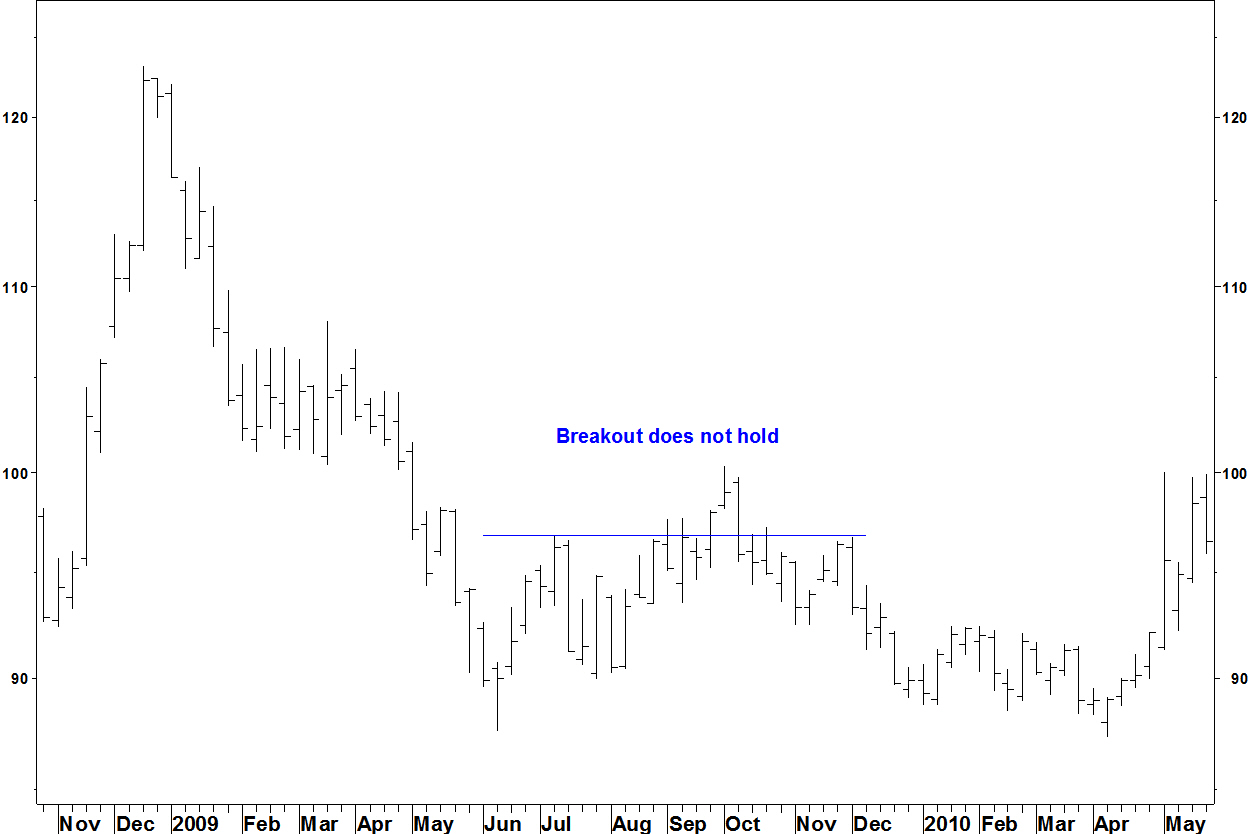
The breakout above the ‘base’ in September 2009 did not hold.
By looking at cycles, I hope to gain some context to the ideas that I find using the other methods described here. I won’t report on cycles here, they are not my ideas. Along with a rejection of pattern based analysis, they should help me with my hit rate.
The performance ranking methodology was added in May 2013. The method is described fully in this posting. The method serves to corroborate the RSI divergence method when applied to pairs charts.
Sectors are ranked on price performance and I look for deterioration of this rank whilst the relative strength of the sector continues higher. Alternatively, I look for improvement in this rank whilst the relative line continues lower. These divergences are then matched with RSI divergences for the sector relative line. In the same way, stocks in a sector ETF can be ranked and compared with the sector relative line and its RSI.
This method is far better than just chasing relative strength, which often reverts. It gives fewer signals than a high or low performance ranking would give but these signals are more reliable.

Trackbacks & Pingbacks