Three years ago, I wrote my last article.
Six months ago, I showed the potential risk in the market and it did not play out. I mentioned that most tops set up with a divergence but that not every divergence is a top. Well, that certainly proved to be the case with Apple.
More surprising to me was that the moving average crossover on the Russell 2000 Index was negated, although I also pointed out the drawbacks of this method.
Russell 2000: Long term moving average crossover negated
Not deterred, I will use the long term moving average crossover method again to show the potential for a long term change. It is the improvement in the performance of some emerging markets against the S&P 500 Index.
iShares Emerging Markets (EEM) versus S&P 500 Index ETF (SPY)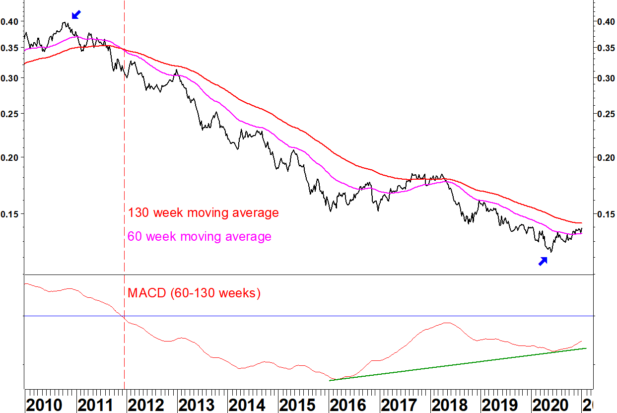
Emerging markets underperformed US markets throughout the previous decade. The ratio dropped by 69% from peak to trough (October 2010 to May 2020). To recover all that would be outperformance by emerging markets of 222%! Even recovering a fraction of that would be significant outperformance.
With this method, you can hand pick moving averages to demonstrate the point. Shorter moving averages show a bullish crossover in 2017, only for it to be negated, so this method needs using in conjunction with other inputs.
The lower chart is a MACD of the two moving averages, adjusted for the scale. It shows a bullish divergence: the averages moved closer together when adjusted for their level. There is the makings of a relative base here but it must do more.
Taiwan leads
iShares Taiwan (EWT) versus S&P 500 Index ETF (SPY)
This ratio did not make a new low in 2020 and the moving averages have made a bullish crossover. It looks like a base. Again, you might have thought that in 2017 but at present, Taiwan is the leader amongst emerging markets.
Chinese small caps possibly form a relative base
iShares MSCI China Small Cap (ECNS) versus S&P 500 Index ETF (SPY)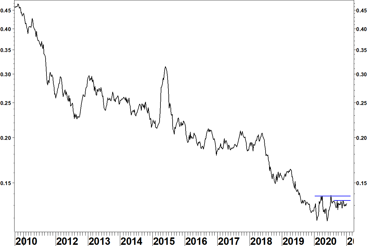
This ratio has dropped hugely over the last decade. There are two resistance levels shown that if broken, could start an outperforming trend.
Dollar effect on ETF ratio charts
These charts show ratios of US listed ETFs, so they don’t need adjusting for forex movements. The US Dollar has weakened recently, which helps the relative strength of non US ETFs.
The Dollar Index does not include emerging market currencies but during 2020, the Dollar has shown commonality in its moves against most currencies, whether developed or emerging market.
US Dollar Index

Since late October, the Dollar Index has made another move lower. There is a bullish divergence on the 9 week RSI. This is a method I have used to identify possiblities for reversion but as with Apple, remember it shows a risk rather than a certainty. I shortened this from the usual 14 periods to get a divergence below 30, so it isn’t as good a set up as in early 2018 but you should be aware of the potential for reversion.
The effect of this Dollar Index fall since late October on the relative strength of the European equities ETF is shown below.
iShares Europe (IEV) versus S&P 500 Index ETF (SPY)
IEV remains in a relative downtrend, there is no sign yet of a relative base. The strengthening Euro during the last two months of 2020 has only moved this ratio back to the falling moving average.
Effect on relative strength of emerging markets
The Dollar is unlikely to give the help to emerging market relative strength in early 2021 that it did during the last two months of 2020. That isn’t the only determinant though. The performance of emerging markets in local currency terms is the other (bigger) factor.
The 69% underperformance of emerging markets over the last decade could give a big push to a reversionary trend.
iShares Emerging Markets (EEM)
The emerging market ETF has gone nowhere since April 2011. For a long time, I saw this sideways movement as a problem: if it can’t make progress when US markets are rallying, surely it will fall when US markets flatten off or decline.
Shanghai Composite Index
This index has gone sideways for five years but didn’t break its late 2018 low in March 2020, unlike many western indices. The March to July gains have been consolidated, so watch for this moving higher and breaking resistance from 2018 and 2015. This market showed between mid 2014 and mid 2015 what it can do in a bullish climate.
Conclusion
There will still be commonality with western markets but the long term relative reversionary potential will start having a positive effect on emerging markets. Taiwan has been an early leader but keep an eye on other markets and individual stocks for moves to outperformance.
Bear in mind that emerging markets can still capture the imagination of western investors to feed a trend of outperformance. Many of the themes that could get discussed (growing middle class, increased energy use, improved corporate governance) have been happening since 2011, they just haven’t been rewarded yet.
Having not touched this blog for three and a half years, I want to put some thoughts down. I was made redundant today from my job in adult education. I had been furloughed for the last three months and have had time to follow markets more closely than in the last few years.
There is huge risk in the current situation but that doesn’t make it certain that equity markets will fall, nor when they will fall if they do. I will use a bellwether stock to show the point.
Apple (AAPL) has a bearish divergence on its 14 week and 14 day RSI.
Apple, 14 week RSI

Apple, 14 day RSI
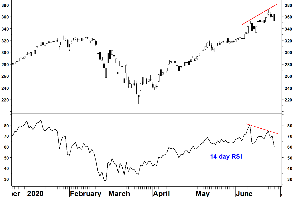
In 2012, I identified a similar divergence situation that led to a 45% decline over the following seven months. My RSI divergence method is outlined here.
Most tops set up with some form of divergence, but not every divergence is a top. Examples are highlighted from 2015 and 2017 where the weekly RSI divergence was blown away.
My observations during the last few years have reinforced my belief that the situation of the broad market is more important than any given stock’s chart.
In this broad market picture, sentiment is worth considering but at present, the two sentiment surveys I follow give mixed signals. Advisor sentiment has become dangerously bullish again whereas individual investor sentiment remains bearish, leaving scope for further upside.
The index chart that best shows the potential danger is below.
Russell 2000: Long term moving average crossover
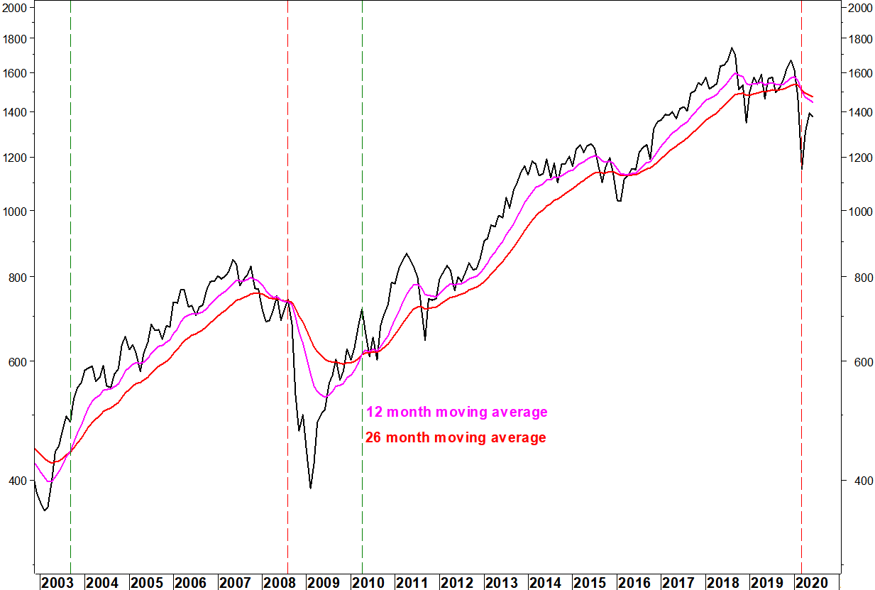
The 12 and 26 month moving averages last crossed in 2010. Using moving averages crossovers is not foolproof, they can at times cross only to cross back a few months later. They give late signals and don’t tell you when the move they suggest will occur. What they do offer is a way of ensuring you aren’t on the wrong side of a major trend for a long time. The method is outlined here.
A cross after 10 years of bullish alignment is a significant warning and if it sticks, it would indicate a broad economic downturn. This will eventually have an effect on Apple. People don’t buy expensive new products when they’ve just been made redundant.
My third article has been posted on seekingalpha.com.
I show that the relative strength of the real estate sector against the S&P 500 Index remains closely linked to the 30 year bond yield. I show that despite yield still being historically low after the post US election increase, a new long term relative low has been made. I suggest an alternative sector for relative return investors.
I’d like to have been able to publish this a week ago, before the resistance break. There is an editorial process at seekingalpha.com and I had to revise the article. It is right that they have that; otherwise it would just be a mass participation blog, otherwise known as social media.
In other news, I passed the Chartered Market Technician (CMT) Level Two exam in October.
*Update: I passed the Chartered Market Technician (CMT) Level Three exam in April 2017, completing the CMT exam programme.
My second article has been posted on seekingalpha.com.
I show infrastructure related sector indices improving their performance compared to the S&P 500 Index. I also show some sectors to sell to increase infrastructure weightings in a portfolio.
In early March, I decided to focus on study for the Chartered Financial Analyst (CFA) Level Two exam. My job wasn’t taking me in the direction of being a market analyst, although it did give me some insights into the corporate debt market. I saw the huge scale of corporate debt issuance and how that has increased in recent years. I also saw that interest rates for corporates were creeping up. This is something that I read has continued, which could become a problem down the line.
I used the time up to early June constructively but it wasn’t enough, it is a very tough exam. I’ll have a head start should I take it again next year.
I also took the Chartered Market Technician (CMT) Level One exam in late April. This was easy enough, it is something I could have done years ago. I passed the Society of Technical Analysts’ (STA) exam years ago but the CMT programme seems to have greater employer recognition. I will take the CMT Level Two exam in October.
I have posted my first article on seekingalpha.com. Although I’ve built a good track record on this blog, enjoyed writing it and learnt plenty, it hasn’t put me out there enough, even with use of LinkedIn and Twitter. I also get a small payment for each article.
My first article covers consumer discretionary stocks. I will post links to the articles from here but I’m not allowed to duplicate the content. I may still post other articles here that I can’t or don’t want to put on seekingalpha.com.
The short position in the NASDAQ 100 from 29 April was stopped out at 4,600 for a loss of 6.0%. This still leaves a gains to losses ratio since the blog started of £3.05 gained for every £1.00 lost.
On 13 March, I set out the trading tactics for entering a short position on the NASDAQ 100 Index. There had been a long term moving average crossover, one of the set-ups I look for. These don’t give the exact timing of a trade entry, so I chose to enter a short on the next weekly reversal.
This will be triggered today and I go short in my model portfolio for this blog. The position is entered at the Friday 9pm price of 4,341, with a stop loss at 4,600, above the 19 April high.
The original moving average crossover has crossed back over slightly, but the long term top formation remains in place and this weekly reversal is a decisive break below the previous two weeks.
This is the right hand side of a top pattern and I’m expecting this to break below the August and February lows.
NASDAQ 100 Index

There has been a decent rally from the bullish breadth divergence that I identified in mid February. Now, major indices have rallied back into long term moving averages that have turned downwards.
A specific set up I look for is a long term moving average crossover, as explained in the My methods section.
NASDAQ 100 Index

- The 30 and 40 week moving averages last crossed over in August 2009
- Divergence on the MACD indicator has been building since early 2014 and this was more pronounced when the final high was made in early December 2015
- The moving averages first crossed in the last week of February, remember that the cross is not an exact timing tool
- Now that price has rallied into falling moving averages, that makes price more vulnerable to continuing the topping process
Trading tactics
Enter a short position in the NASDAQ 100 Index on the next weekly reversal, with a stop loss above the most recent high. A weekly reversal this coming week will be below 4,232.08 or on the NASDAQ 100 Trust ETF (QQQ), below Thursday’s low of $103.31.
I will record this trade in the P&L for this site when it eventually is triggered.
The Russell 2000 Small Cap Index has set up with bullish divergences on its 14 day RSI and one of its moving average breadth indicators (the % of stocks above their 50 day moving average).
This repeats a set up in late September 2015 (dashed line) from which the index managed an 11% rally into early December.
Russell 2000 Index, 14 day RSI, 50 day breadth
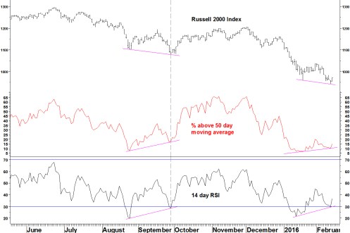
- The long term moving averages having rolled over, so I wouldn’t play them from the long side, we are in a bear market
- I expect a rally to be smaller and over quicker but I would wait for a better entry opportunity on short positions
- This means when this divergence has unwound and price is closer to the long term moving average (e.g. 40 week average)
Educational reference on divergences
My methods with daily and weekly RSI divergences
Examples of daily RSI divergences and how they turn out
Follow up on those 8 months later
All week I have heard mainstream media commentators say that because major indices have dropped 20%, this means we are in a bear market. A few add the phrase ‘a sustained drop’ but most don’t.
Let’s look at the last 20% drop in 2011.
S&P500 Index

Between May and October, the index dropped 21.6% but then rallied to a new high.
Many other national stock indices did likewise, including the FTSE100 Index. Other examples include the Indian and Brazilian national stock indices in 2004 and 2006, which had 20% drops in the middle of strong bull markets.
How can we tell which 20% drops really are bear markets?
There are three ways to look at this but they are manifestations of the same thing: falling participation in the bull market
1. Divergences on cumulative breadth indicators
Bull market peaks form with breadth divergences. The number of stocks participating in the rally drops off when the index peaks.
In June 2015, I showed how the cumulative advance-decline line for the NYSE Composite Index had formed a divergence at the May 2015 high.
The chart is updated below:

Contrast this with 2011 when the late April high was confirmed by the cumulative breadth indicator.

2. Divergences on range bound breadth indicators
In November, I showed that the percentage of stocks above their 200 day moving average on the SPDR Consumer Discretionary (XLY) had formed a very pronounced divergence.
The chart is updated below:
SPDR Consumer Discretionary (XLY) and % above 200 day moving average
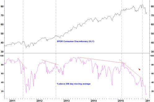
The ETF has since fallen from $81.47 to $73.31. Note that plenty of minor divergences did not end the trend: the more pronounced the divergence, the more likely it will have an effect.
3. Sector indices rolling over
As a bull market matures, whole sectors drop out of contributing to the uptrend. I took a sample of 50 US sector indices (not completely scientific but a sample of the 67 Industries from the S&P GICS framework).
Here is how many had rising 200 day moving averages at various dates:
29 April 2011 (closing high on the S&P500 Index then)
46 out of 50 rising
21 May 2015 (closing high on the S&P500 Index)
39 out of 50 rising
20 July 2015 (retest the May high, only 0.1% lower)
29 out of 50 rising
03 November 2015 (retest the May high, only 1.0% lower)
34 out of 50 rising
22 January 2016
7 out of 50 rising
- At the peak, there were 7 fewer rising moving averages than in April 2011
- By July, although the index was almost unchanged, another 10 sectors had dropped out
- By the November peak, the number had recovered (to my surprise) but still one third of sector indices had a falling moving average
- At the April 2011 peak, there had not been a deterioration at the sector level, so there was a pull back within an uptrend rather than the start of a bear market
Conclusions
- There is enough breadth deterioration to mean that indices have topped
- Don’t let the media tell you that every time indices drop 20%, this automatically means that it is a bear market
