07 May
The chart shows the NASDAQ Composite Index along with the cumulative line of new 52 week highs minus new 52 week lows.
- Major market peaks in 2000 and 2007 came with divergences on the breadth line.
- The 2000 divergence two years to play out following the breadth peak in 1998.
- This shows that a divergence does not mean the market will fall, just that conditions are in place for a top.
- The 2007 divergence set up between July and October, much quicker.
- Now, a divergence is in place again, with breadth having peaked in July 2011.
- The breath line has rallied since the start of 2012. Seeing it turn down is required to call the top, otherwise the index and breadth line could just rally and eventually the divergence would be negated.
The next chart is the same indicator on the NYSE stocks, with the NYSE Composite Index above.
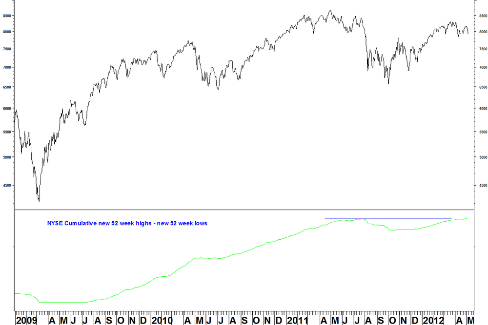
- The chart shows that there has been no breadth divergence yet sine the 2009 low. The indicator has just broken its 2011 high (even though the index has not) and continues to rise.
- The shortcomings of pattern analysis are demonstrated here. In summer 2010, many people saw a break below a top formation and suggest that was it for the rally. But there had been no breadth divergence.
- This breadth line shows a different story to the NASDAQ and this may be due to there being more bond funds on the NYSE, which have been rallying.
- The picture is similar on the weekly highs/ lows line. There is almost a new indicator high and the line still rises.
Conclusion
- Without divergences for the highs/ lows breadth indictor on all exchanges, nor a turn down in the indicators, it is too early to say that the spring 2012 index highs are THE market top.
- We must wait for the NASDAQ indicator to turn down. If at that time we lack agreement from the NYSE, that will weaken the case for a top but not rule it out completely.
I will look at the advance – decline data on the NYSE another time.
07 May
This week I will show my findings from some breadth data that I have got Pinnacle Data Corp.
Breadth indicators show the number or percentage of stocks in a group that are going up. The criteria for ‘going up’ is always a calculation, not an opinion. At stock market peaks, breadth indicators show an index uptrend weakening through lower stock participation. The index makes a new high but the breadth indicator does not: there is a divergence. Things are different at lows but given the rally since spring 2009, the current focus is on whether there are any breadth divergences that suggest a market top. You can use whatever you like as your criteria for ‘going up’ but there are some common measures.- %age of stocks in a Point and Figure uptrend
- %age of stocks above a moving average
These are the main two that can be targeted at any group of stocks you like. You can vary the criteria of each to show long and short term breadth conditions.
The data from Pinnacle is broad market data, it includes all stocks on an exchange, even things that trade as stocks but aren’t really stocks (like bond funds). For the NYSE, NASDAQ and AMEX there is:- The number of advancing issues (stocks) and declining in issues.
- The number of new 52 week highs and new 52 week lows.
- The total volume of advancing issues and declining issues.
Data is provided for these each day and for some, on a weekly basis. The weekly basis is not the sum of the days. You could have four days of fractional gains and one big down day, a net of three advancing days but one declining week.
Data is plotted cumulatively: add the next day to the running total. Some data goes back to the 1960s, much to the early 1980s. What is the predictive track record of this data in predicting tops?- The new highs/ new lows data has the best predictive record
- The cumulative new highs/ new lows lines are smooth, they have less noise, so are easier to interpret
- This data works well on all of the NYSE, NASDAQ and AMEX but best on the NASDAQ stocks
- The other two measures on the NASDAQ have poor track records
- The advance decline data has some use on the NYSE but doesn’t help at all on the NASDAQ and AMEX
- The advancing and declining volume data has a patchy record
These observations apply across the data and weekly data. I will show the current observations in a separate posting.
30 April
This is another update on how my ideas shown here have progressed. I will start with the best one! AEM vs XAU: This ratio made good progress last week, with AEM up 18.7%. The ratio is up 21.5% on the entry point from the start of April.
The daily RSI is now overbought but the weekly RSI is not yet overbought.
At this point, you could take partial profit but I don’t have well defined rules for ongoing trade management in the same way as I as do for entry criteria. SLE vs ADM: On Friday 13 April, this ratio broke to a new high. There has been modest progress since.
RIMM vs NASDAQ 100: Last week, I stated that an end of week close for the 14 week RSI above the intervening high would be an entry signal. That occurred on Friday, so this trade is on. The ratio is up 2.5% today.
Last week, I stated the stop loss as a move back into oversold on the weekly RSI or a weekly reversal. Some people will prefer a fixed stop loss, which would be a new low for the ratio below the 05 April low. That is 10.1% lower.
Other ideas: Natural Gas: I had shown the weekly RSI divergence building on Natural Gas. Last week, there was a weekly reversal and a move back above the oversold level for RSI, although a format RSI buy signal is the move above the intervening high.
None of the stock ratios I mentioned have reached RSI divergence signals. Encana (ECA) rallied sharply before reaching a divergence.
KOF vs EWW: This ratio still consolidates. I am looking for a Bollinger band breakout.24 April
Research in Motion (RIMM) has been the subject of much commentary, regarding the defeat of Blackberry by other devices. Now, everyone knows the story, it might be the low, on relative strength at least.
Plotting RIMM against the NASDAQ 100 Index, there is a bullish weekly RSI divergence and a MACD divergence.The MACD that I used is adjusted for the fact that the ratio has fallen so much.
- The late 2011/ early 2012 divergence was not followed by a break above the intervening RSI high, so did not set up as required.
- Now, the intervening RSI high is from the week ending 20 January, just above 30.
- With the RSI just below 30 as of last Friday, an outperforming week will give this signal.
- Today, RIMM outperforms and the buy signal would be an end of week close for the RSI above that intervening high.
On the daily chart, there have been a succession of RSI divergences that have failed to hold the decline, which is why I look for weekly divergences. Now the daily RSI is above 30 and the MACD (adjusted again) also has bullish divergence.
The stop loss would be a move back into oversold on the weekly RSI or a weekly reversal. I’ve seen RIMM described as a binary bet, a company that could go under. I’ll leave the fundamentals to other people, here is a decent trading set up that meets my RSI divergence criteria.
23 April
The U.S. Dollar versus Japanese Yen (USDJPY) has made a long term low, if my moving average crossover method is to be believed. On my methods page, I explain that I’m looking for series that have spent a long time (preferably four years) on one side of two moving averages and have now crossed them, leading to a moving average crossover.
U.S. Dollar versus Japanese Yen (USDJPY)

The chart has 30 and 40 week moving averages. The shorter average was below the longer from September 2007 and the crossover has just occurred. The MACD had a bullish divergence at the low in Autumn 2011 but that was not the first divergence on the way down. Divergences can only be an alert, we still have to wait for the price to move.
Following a sharp rally in February and March, price has pulled back to the averages. These averages may now appear to be support but things are rarely so tidy (just look at the downtrend). Moving averages don’t make anything happen, they just follow price and I now only use them to identify long term changes such as this. The next chart shows that when the rally started in February, the 30 week Bollinger Bands were historically tight. Similar degrees of band contraction produced moves in 1991, 1995, 2000 and 2003.
I usually look for contraction of the 40 week Bollinger Bands on stocks but the most relevant parameters vary by instrument. For USDJPY, 30 weeks bands have a good track record of producing quick breakouts following band contractions. Quick breakouts are preferable to bands that meander along before expanding.
My former colleague Ron William has discussed long term cycles for USDJPY, which you can see here.16 April
Here is an example of a stock poised to continue its outperformance. Its relative strength has consolidated over the last eight months, so tightening the Bollinger Bands. The stock is an ADR: Coca-Cola FEMSA (KOF), the Mexican bottler of said beverage and others. KOF came up on a scan for stocks whose relative strength against the S&P 500 Index has the tightest Bollinger Bands for the last three years. I’ve shown KOF against the iShares Mexico (EWW). The ratio also meets that criteria, plus the currency effect of the US$ to Peso rate is removed from consideration.
Unlike my previous Bollinger Band example, this clearly has a rising moving average, so the expectation is for continuation higher. Being a consumer staples stock, it is defensive, so tends to outperform EWW when the market is falling, or at least not rising strongly.
The entry criteria is an end of week close above the band and an expansion of the bands. The bands are still contracting quite steeply so this may take several weeks to set up.16 April
This is a quick update on how the ideas shown have progressed.
- SLE vs ADM: On Friday 13 April, this ratio broke to a new high, the entry signal stated on 03 April.
- AEM vs XAU: This ratio makes progress, the position is up slightly.
- Natural Gas: continues to fall but the weekly RSI divergence situation remains in place, so it is still worth looking for a weekly reversal.
XEC vs SPX: This ratio continues to pull back. You could still buy after a short term base.
NFG vs SPX: This ratio has continued down, blowing away its weekly RSI divergence with a new low for the RSI. It needs to set up again according to my RSI divergence criteria.
Other natural gas stocks vs SPX: None on the six mentioned on 10 April have met the criteria yet, but Encana (ECA) is closest. ECA vs SPX will make bullish weekly RSI and MACD divergences with a bit more of a decline.
- IAI vs EEM: The first Bollinger Band breakout trade hasn’t worked and I said the following week, that trades that don’t work quickly can be ditched before reaching their stop loss. Enough said on that one.
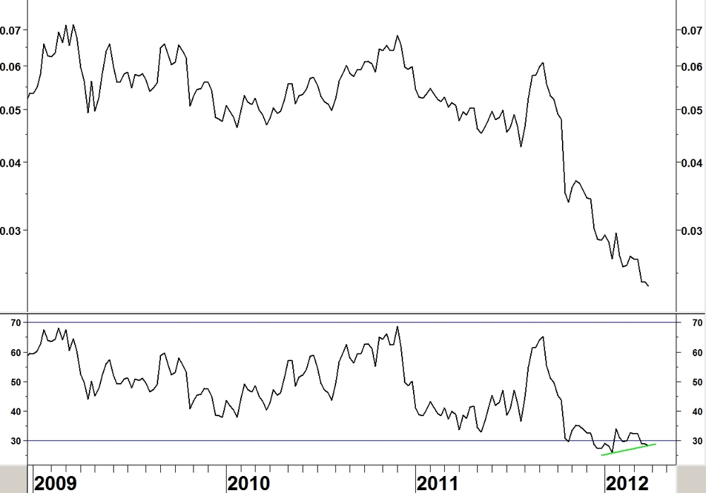
U.S traded Natural Gas has halved since summer 2011 but the latest decline gives it a bullish divergence on the 14 week RSI, just as in May 2009.

Daily chart

- The end of March low is a divergence against the January low (albeit fractionally above 30 – not quite meeting the stated criteria)
- The last low of 05 April has RSI above 30
The reason for the low price is the mild winter and the record levels in storage. The fundamental reasons why the price could rally are stated in this article by David Fessler.
I will focus on the relative strength of Natural Gas stocks rather than price.
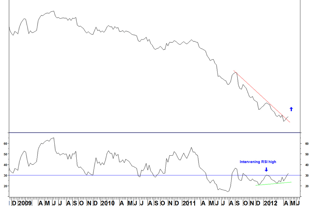
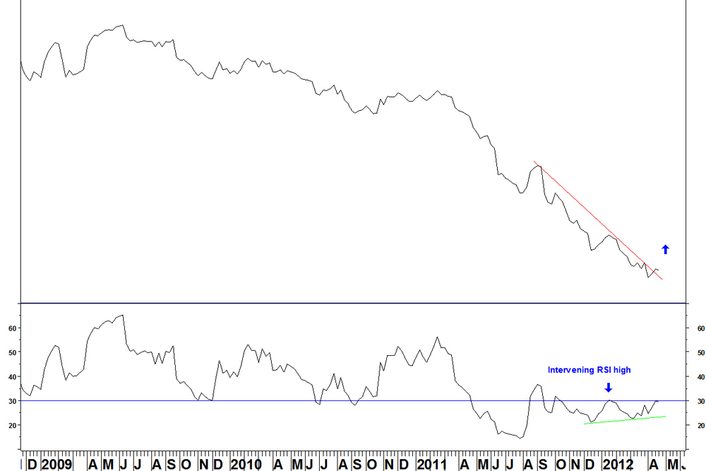
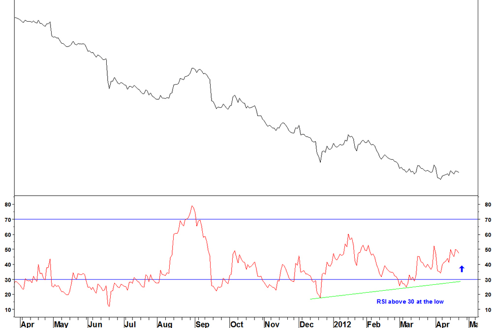
National Fuel Gas Co. (NFG) versus the S&P 500 Index
This stock has a range of operations, it is mainly a utility but also is a gas producer (I prefer to call it an extractor). More importantly, it meets the RSI divergence criteria.

- On the weekly chart, the stock versus S&P 500 Index is on its second bullish RSI divergence
- It has not yet given a buy signal of a move above the previous RSI high or a weekly reversal
Daily chart
- The first weekly divergence of mid February did not meet the criteria for the daily RSI: RSI above 30 after a divergence that failed to hold the decline
- The current divergence meets these criteria
- So we wait for the entry criteria of the weekly RSI going above the intervening (09 March) high
- At your discretion, you can take a decisive break of the relative downtrend and rally from the low, with the 09 March RSI high being broken.
- Looser criteria means more trades and closer stop losses but slightly higher chance of a false signal
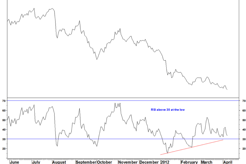
Cimarex Energy (XEC) versus the S&P 500 Index
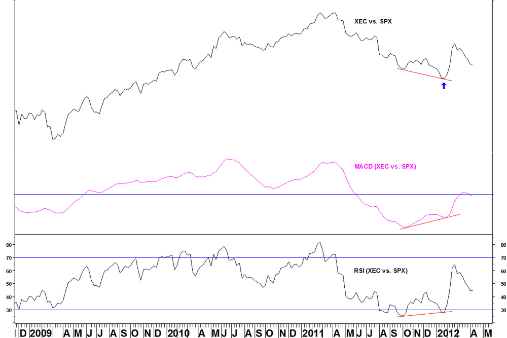
The ratio had bullish divergences on its weekly RSI and MACD at the January low.
Daily chart

On the daily chart, there were three RSI divergences that failed to hold and the eventual low in late January came with RSI above 30. This serves partly as an example of a trade that matched the RSI divergence criteria, but what about now?
There has been a pullback, which may be another entry opportunity. Large moves rarely happen in one go, so we can watch for a short term relative base to develop. Then, on a move higher, set a stop below that base for a pairs trade.
Other stocks which may meet the RSI divergence criteria (versus S&P 500 Index) soon are:
Apache (APA)
Atmos Energy (ATO)
Bill Barrett (BBG)
Chesapeake Energy (CHK)
Encana (ECA)
GMX Resources (GMXR)
These stocks on the face of it should be more correlated to the natural gas price than NFG but that is the current example, wait for an entry signal.
I will keep you posted if any of these stocks meet the criteria.
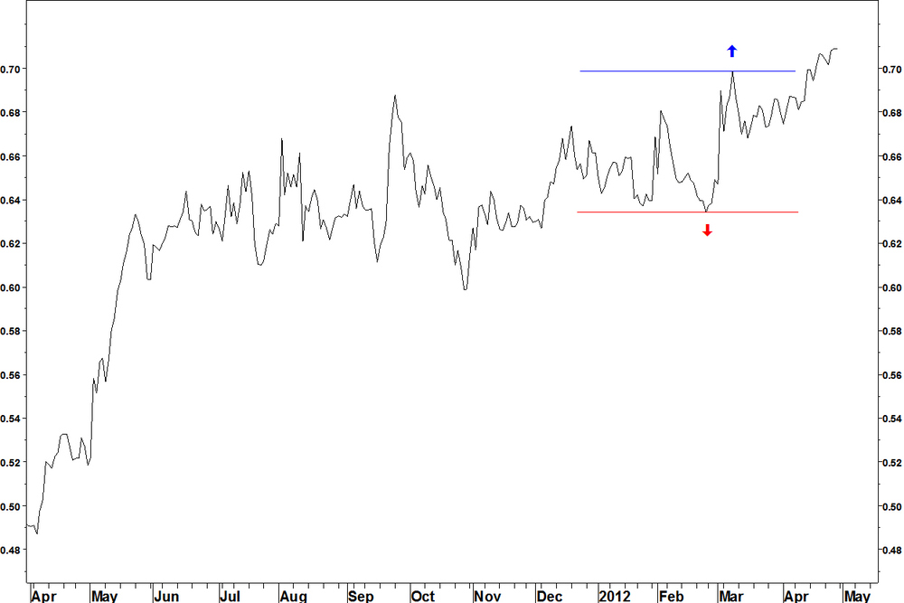
Sara Lee (SLE) has a long term base against Archer Daniels Midland (ADM). The ratio has traded sideways since May 2011, allowing the 40 week Bollinger bands to contract to their tightest in years.
The entry signal stated in my methods page is an expansion of the bands and an end of week close beyond the bands. That has occurred once already and did not follow through. Last week’s move was fractionally above the band but has not yet taken off.
A Bollinger Band contraction does not predict the direction of breakout but we can take clues from the direction of the moving average. This still rises and since early March, the ratio has been at the top of its range, not reacting sharply to resistance.
The daily chart shows a more precise entry and the stop loss (as stated) is a move back beyond the consolidation that preceded the breakout.
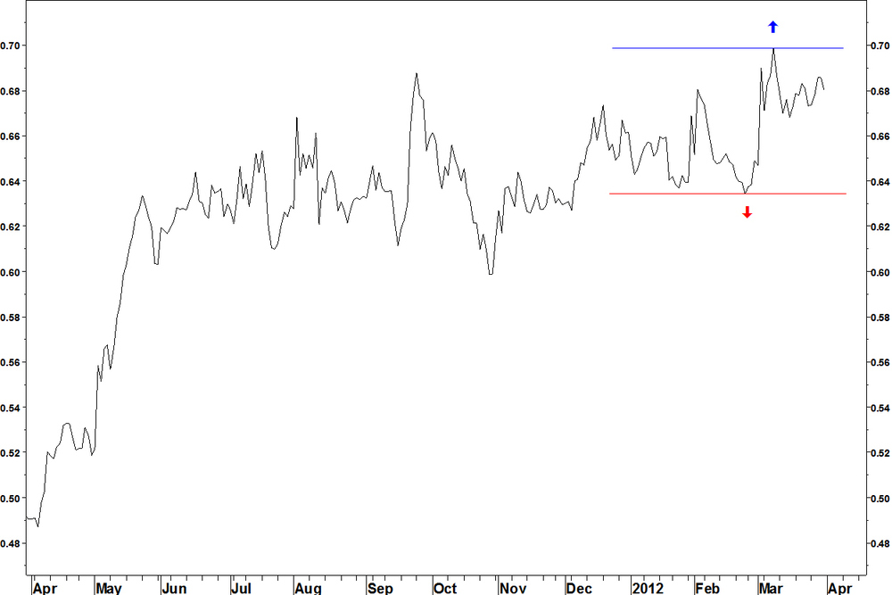
As we already have the end of week move above the band, the entry signal can be an new high on the daily chart, above 0.69881 on the ratio. The stop loss can be below the early 2012 range, below 0.63423. That is 9.2% lower and if that is too much, you can use the 15 March minor low, half way up that range.
Alerts on ratios can be programmed in the TradeStation platform. These can be made on intraday bars also, which might be a good idea because if this works, it could move quickly. Ask me how that’s done if you are interested.
This week I’ll show a gold stock: Agnico-Eagle Mines (AEM) with a bullish 14 week RSI divergence against the S&P500 Index.
Gold stocks have dramatically underperformed the S&P500 Index since September 2011.
Now compare AEM against other gold stocks Agnico-Eagle Mines (AEM) versus Philadelphia Gold & Silver Index (XAU)
- In this case the divergence was in place through the winter. The rally from the February low has taken the RSI back above 30
- The shallower decline of the last leg down is evident
The daily ratio chart shows the other criteria being met.

- Successive bullish daily RSI divergences that fail to stem the decline
- A divergence that has the RSI above 30 at the low
- There isn’t a weekly MACD divergence (preferable but not essential) but there is a daily MACD divergence
- Now the initial rally has taken place, the ratio consolidated since 09 March
- Monday’s action (not yet shown) had AEM up 4.73% and XAU up 1.97%, breaking the 09 March high (blue line)
- That is a buy signal for this pair, with the stop loss below the red arrow, the 21 March minor low (5% lower)
Last Monday’s idea hasn’t worked so far [buy iShares Broker Dealers (IAI) versus iShares Emerging Markets (EEM)]. It hasn’t been proved wrong yet and is nowhere near its stop but you can often tell which ideas will work by how the trade starts off.
