New highs and lows data on the NASDAQ and NYSE
07 May
The chart shows the NASDAQ Composite Index along with the cumulative line of new 52 week highs minus new 52 week lows.
- Major market peaks in 2000 and 2007 came with divergences on the breadth line.
- The 2000 divergence two years to play out following the breadth peak in 1998.
- This shows that a divergence does not mean the market will fall, just that conditions are in place for a top.
- The 2007 divergence set up between July and October, much quicker.
- Now, a divergence is in place again, with breadth having peaked in July 2011.
- The breath line has rallied since the start of 2012. Seeing it turn down is required to call the top, otherwise the index and breadth line could just rally and eventually the divergence would be negated.
The next chart is the same indicator on the NYSE stocks, with the NYSE Composite Index above.
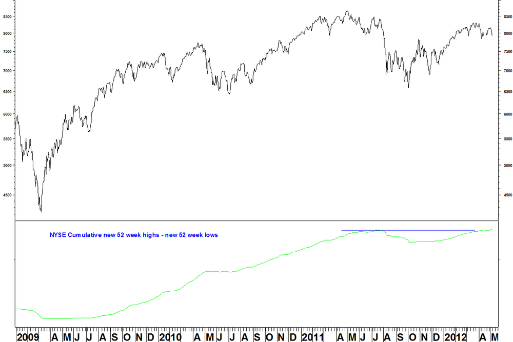
- The chart shows that there has been no breadth divergence yet sine the 2009 low. The indicator has just broken its 2011 high (even though the index has not) and continues to rise.
- The shortcomings of pattern analysis are demonstrated here. In summer 2010, many people saw a break below a top formation and suggest that was it for the rally. But there had been no breadth divergence.
- This breadth line shows a different story to the NASDAQ and this may be due to there being more bond funds on the NYSE, which have been rallying.
- The picture is similar on the weekly highs/ lows line. There is almost a new indicator high and the line still rises.
Conclusion
- Without divergences for the highs/ lows breadth indictor on all exchanges, nor a turn down in the indicators, it is too early to say that the spring 2012 index highs are THE market top.
- We must wait for the NASDAQ indicator to turn down. If at that time we lack agreement from the NYSE, that will weaken the case for a top but not rule it out completely.
I will look at the advance – decline data on the NYSE another time.
Leave a Comment
