25 June
Pinnacle Data Corp provide breadth data for eight market capitalisation segments. These are: NASDAQ 100 IndexRussell 1000 Index (large cap)
Russell 2000 Index (small cap)
Russell 3000 Index (the two above combined)
S&P 100 Index (100 largest cap stocks)
S&P 500 Index (large cap)
S&P 400 Index (mid cap)
S&P 600 Index (small cap) For each segment, the following breadth indicators are available. Actually there are a few more but I’ll focus on these eight: 5 moving average breadth indicators
%age of stocks above their 21 day moving average
%age of stocks above their 50 day moving average
%age of stocks above their 80 day moving average
%age of stocks above their 100 day moving average
%age of stocks above their 200 day moving average 3 cumulative type indicators
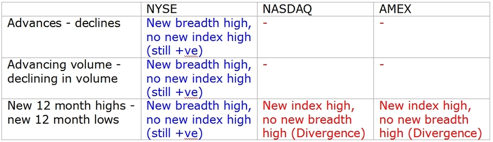
Advances minus declines
Advancing volume minus declining volume
New 12 month highs minus new 12 month lows This data is only available from the start of 2008. More history would have been better but it is still useful. How do we judge which indicators are the most useful? I will focus on the cumulative breadth indicators in this blog. The moving average breadth indicators will be in the next blog. For the cumulative indicators, as before:
- Do market tops come with divergences
- Do divergences lead up to market tops
What do the indicators show?
Looking at what each indicator shows tells us something about the divergences (or lack of them) seen in the broad exchange based cumulative breadth indicators. A short history is available but there are still some conclusions on the effectiveness of each indicator. High/low indicators Starting with these, as they have been found the most useful on the exchange based indicators. The large cap breadth indicators (S&P 100, NASDAQ 100, S&P 500, Russell 1000, even the S&P 400) confirm the market index advance. S&P 500 Index and cumulative news highs minus new lows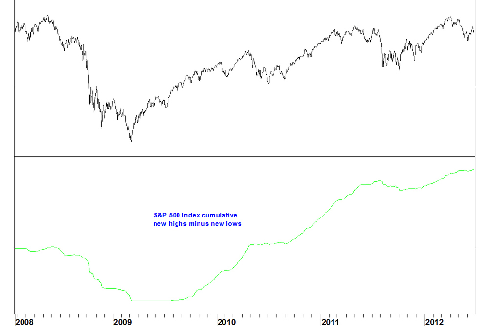
The breadth indicator advances in line with the index.
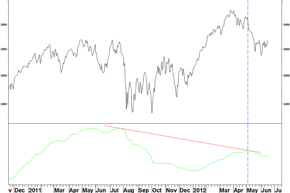
The small cap breadth indicator makes a lower high, and this is clearer on the Russell 2000 than the S&P 600. Russell 2000 Index and cumulative news highs minus new lows
This is not a divergence against the Russell 2000 Index, as both make lower highs than in 2011. We can say though that the Russell 2000 breadth indicator (and price) do not confirm the advance in the S&P 500 Index.
Advance/decline indicators The conclusion is the same for the advance/decline indicators. Notice that these are choppy charts whereas the high/low charts are smooth lines. S&P 100 Index and cumulative advances minus declines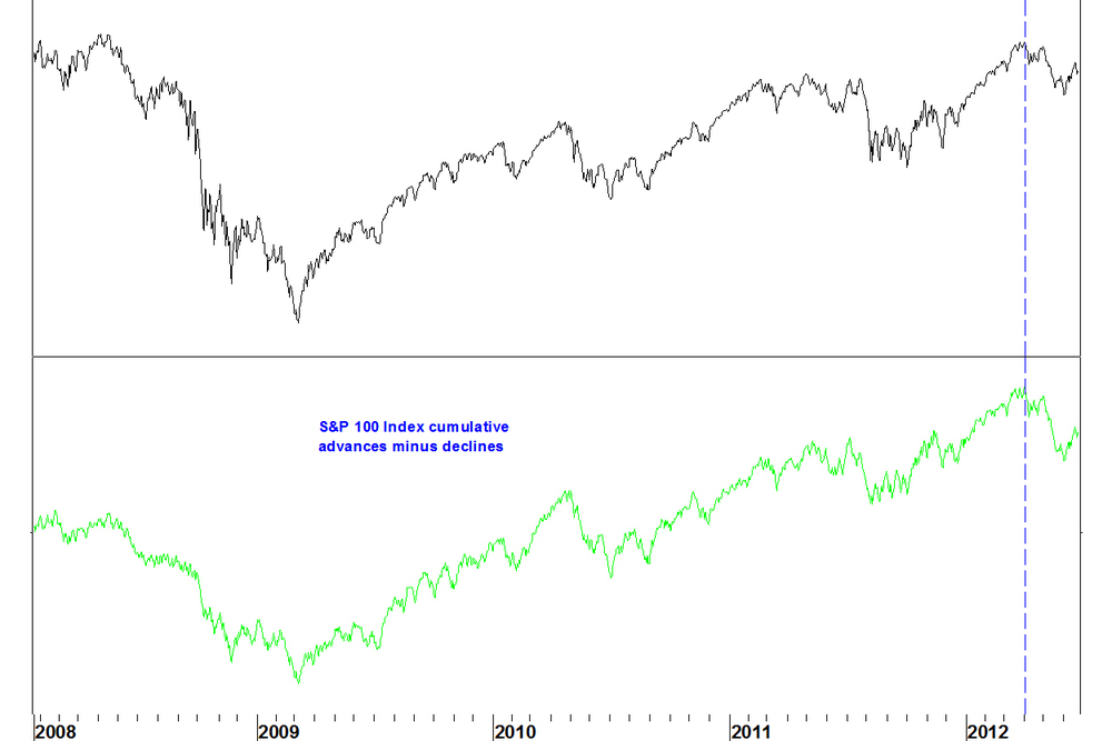
Advancing volume/declining volume indicators
These indicators are the least useful. On the large cap indices, these showed a divergence in 2011 but this did not play out. NASDAQ 100 and cumulative advancing volume minus declining volume
The divergence in 2011 did not play out, so why take notice of the current divergence?
Conclusions- The highs/lows and advance/decline indicators have forecasting value but the volume indicator does not
- The fact that divergences only appear on the small cap indices supports the idea that the difference between the broad NASDAQ and NYSE indicators is due to foreign bodies (bond funds) distorting the NYSE cumulative breadth indicators
- This supports the idea that the broad NASDAQ highs/lows indicator is the one to follow most closely. It shows a divergence.
Further points to note
- It would be hard to have a NASDAQ breadth divergence without the small stocks contributing to this anyway, as there are so many more of them
- We can’t (from this data at least) see how the other capitalisation sizes behaved at the last market top. I can, using FIRE, build custom stock groups to examine breadth indicators over a longer period. These will be on static stock groups, not accounting for index membership changes.
25 June
Also available from Pinnacle Data Corp are weekly breadth series on the NYSE, NASDAQ and AMEX exchanges. Weekly breadth data shows the number of advances, declines, highs, lows etc over the week rather than for five separate days. For example, there could be four small up days and one large down day in a week, down enough to make it a down week. The daily cumulative breadth total would be +3 but the weekly total would be -1. The rationale for weekly series is that a Friday closing price is more important than a mid week closing price. If a move holds by the end of the week, it is more noteworthy. This data is available since 1981 (1986 for NASDAQ weekly highs/lows). The volume data only is available for the NYSE but has recently become very erratic. So there are six series to focus on. What is the predictive record of this data? Predictive record of weekly cumulative breadth data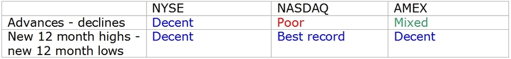
There are some differences in what this data shows compared with the daily data. The current situations of these indicators are contradictory.
- The NASDAQ highs/ lows series has the best predictive record and so the state of this indicator is the most important factor. Like the daily series, this shows a divergence
- Countering this, the NYSE and AMEX advance/ decline series, which have decent and mixed records respectively are still positive. There is no divergence
Conclusion
The weekly series do not offer us a great deal different to the daily series. Whilst it is good to see the NASDAQ highs/ lows series tell the same story as the daily series, if something is not standing out clearly, it is best to move on to something else. In the next blog, I’ll look at the breadth indicators for the different capitalisation size market segments. That will give some insight into the reasons why these exchange based indicators behave differently.
25 June
I have a wide range of broad market breadth indictors from Pinnacle Data Corp and here I’ll describe them and elaborate on previous blogs on which have the best track record. The first group of data covers three exchanges separately:- AMEX
- NYSE
- NASDAQ
There are three types of indicator:
- Advance/ decline
- Advancing volume/ declining volume
- New 12 month highs/ new 12 month lows
Example of breadth indicator calculation
For example, the number of advancing stocks on the NASDAQ each day is given, along with the number of declining stocks. It is difficult to make sense of data in this form, it varies hugely each day. Instead, we plot cumulative breadth indicators.
Each day, calculate the number of advancing stocks minus the number of declining stocks and add this to the running total, giving one data series to plot.- Confirmation of the health of an advance comes if new index highs are matched by a new cumulative breadth indicator high.
- Divergence comes when new index highs are not matched by new breadth indicator highs.
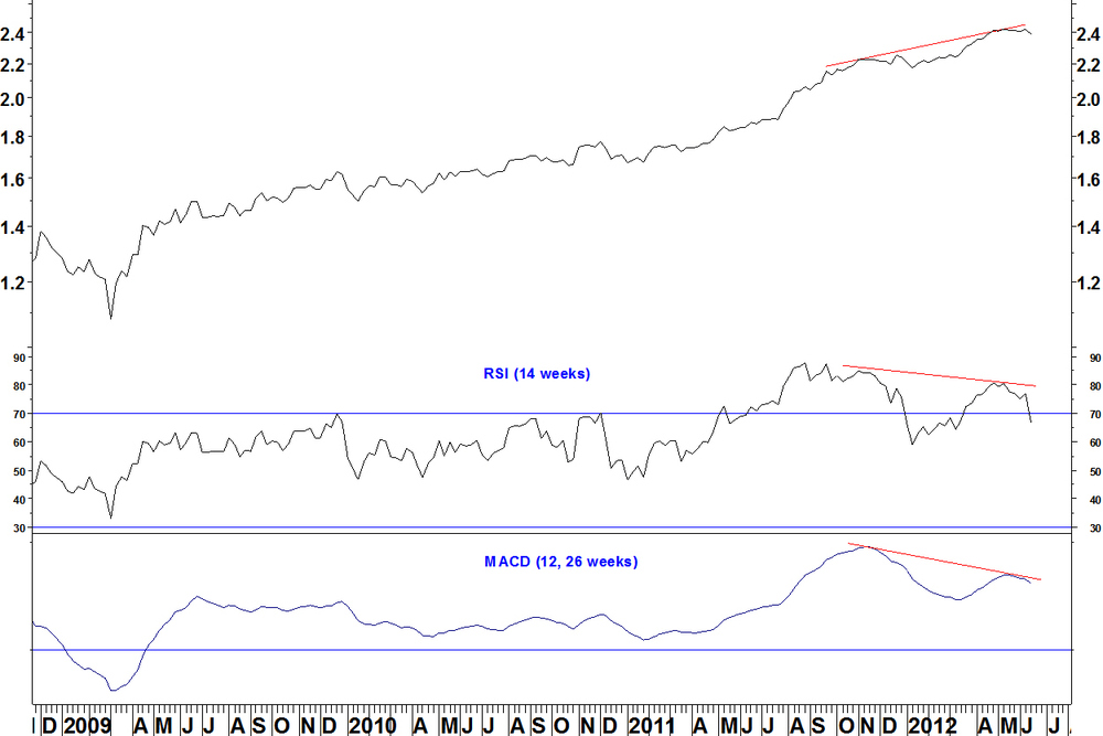
Example: NASDAQ Composite Index and NASDAQ Highs – Lows breadth indicator

- The cumulative breadth indicator (lower window) confirms the index advance up to mid 2011
- Therefore, when ‘top formations’ were apparent in mid 2010 and August 2011, there was no breadth divergence to support this. This demonstrates the limitations of pattern based analysis
- Now, there is a divergence on this indicator, suggesting a long term top could form
Predictive record of exchange wide breadth indicators
Here is a summary of the predictive record of this data. The criteria are:- Do market tops come with divergences in these cumulative breadth indicators
- Do divergences lead up to market tops
This is judged over the history of the data:
NYSE data: since 1940, but 1965 for the high/ low data
NASDAQ and AMEX: since 1978
The major criteria are whether divergences are shown at the 1973, 2000 and 2007 highs. Other points of interest are in 1968, 1987, 1990.
Predictive record of cumulative breadth data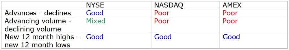
Here are the current situations of cumulative breadth indicators, where the track record suggests it is worth noting. These compare the latest index peaks (in March 2012) and the cumulative breadth indicator with their levels at the previous market peak in April 2011.
Why is the NYSE breadth data positive, actually showing breadth moving ahead of price, whilst the NASDAQ and AMEX breadth data (highs minus lows) shows divergences?
Here is a quote from the Greg Morris book ‘The Complete Guide to Market Breadth Indicators’:‘..more than half the issues traded on the New York Stock Exchange are interest rate sensitive, which even includes preferred stocks and closed-end bond funds. Because their inclusion can sometimes distort the NYSE breadth data…’.
So bond funds, which have been rallying due to falling interest rates since mid 2011 (the last breadth indicator high) are helping the NYSE breadth data stay positive. Meanwhile, the NASDAQ and AMEX breadth measures worth looking at show divergences. Ideally, the NYSE breadth measures would confirm the NASDAQ and AMEX measures, as was the case at the 2007 high but we don’t have that here. Conclusions- Given the bond fund action of the last year, I would pay more attention to the NASDAQ High/ low line than the NYSE breadth measures, even though the NYSE measures also have a good track record.
- The breadth divergence on the NASDAQ Highs – lows line is in place and serves as a warning of a possible market top developing. It does not however give the timing of when the market might break down.
I’ll continue later by looking at other breadth data provided by Pinnacle: weekly breadth data and breadth data broken down by market capitalisation size.
25 June
Since starting my blog three months ago, I’ve made some good calls, mostly using my RSI divergence and Bollinger band methods. Have a look back over the blog and ask me anything about it. Breadth indicators are another tool that I have wanted to use, as described in my methods section. The theme of this blog is identifying those rare times that have exceptional circumstances, offering high probability and low risk entry points. Breadth indictors can help identify these times. I’m now in a position to offer you a breadth product that will do this! I have two sources of breadth data, which combine to make a complete package of broad market indicators and customisable breadth data.- Broad market breadth indicators on U.S. indices and exchanges. This data comes from Pinnacle Data Corp.
- Calculated breadth data on user defined lists of stocks. I can calculate various breadth indicators on any list of stocks that you are interested in, using the Metastock Add-on program FIRE.
It has taken a bit of effort to get hold of FIRE but I’m excited about the possibilities this product offers. I still have to figure out everything about how it works but with it, I’ll be able to offer you insight that other sources of breadth information do not offer.
Realise this comes in two parts.- The capability of FIRE to calculate and show breadth indicators on any list of stocks
- The understanding of what the data means and ability to explain it
I’ll continue later with what I can show you from the broad market breadth data, which I have already introduced.
25 June
This week, I’m going to focus mostly on breadth. I’ve got a new toy, which means I can run breadth indicators on hand selected stock groups. This could be you selecting which stocks you are most interested in and using me to provide breadth analysis on them! More on that later. First, an update on how some ideas I’ve been following have developed. Last comments were on 11 June. U.S. Dollar v Japanese Yen A decent move last week gives the base formation on the daily chart that I referred to.
The MACD on the 30 and 40 week moving averages has not quite gone positive yet. Another up week and that will happen, which would be a long term entry signal. You could use a move of the MACD back below zero as a stop loss, or a move below the early June low. If you think that is a wide stop, well, this is a long term call, not something to be traded in and out of regularly.
Simon Property Group (SPG) v iShares Real Estate (IYR) Last week, I showed this breaking below the base formation. It then rallied straight back up.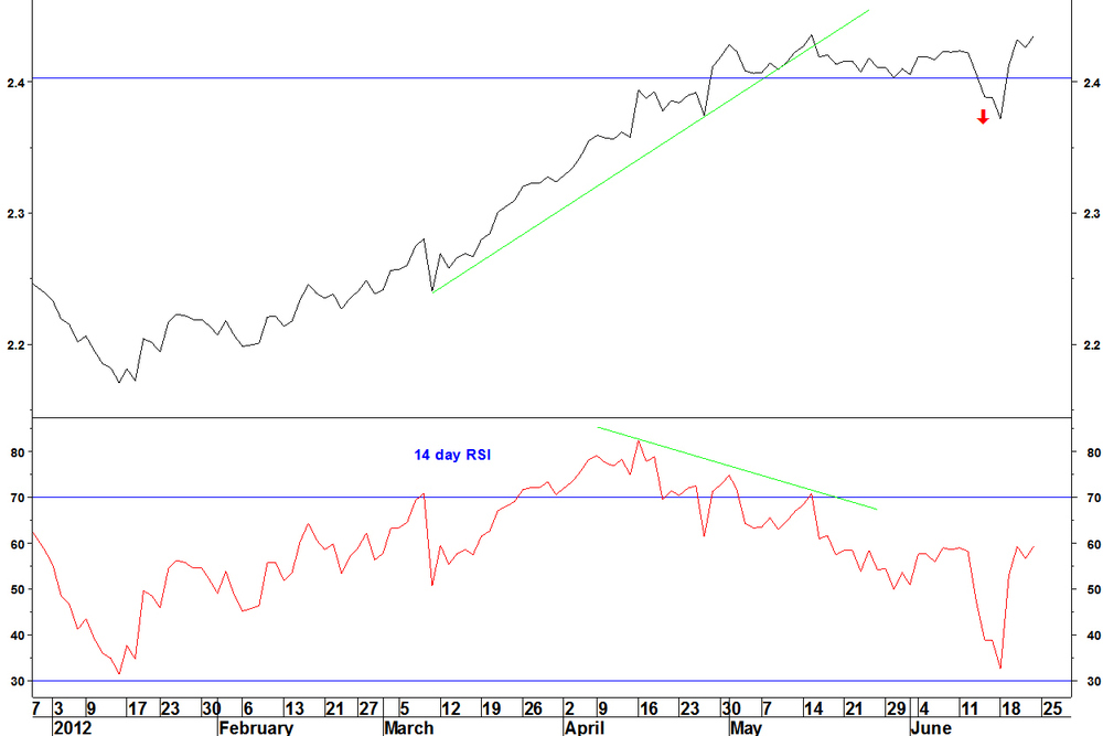
This hadn’t met all the criteria for an RSI divergence trade entry (the daily RSI wasn’t below 70 on making the high). Long term, RSI and MACD divergences remain in place, they might just take longer to play out that I expected.

Patni Computer (PTI) v NASDAQ 100 Trust (QQQ)
This continues to consolidate between Bollinger bands. Research in Motion (RIMM) v NASDAQ 100 (NDX) This ratio continues down but remains an RSI divergence trade possibility, just wait for the entry criteria to be met. Bonds The U.S. 30 year bond yield consolidates above its low after its bullish weekly RSI divergence.18 June
Back on 21 May, I showed an example of an RSI divergence trade on a real estate stock pair. The pair was Simon Property Group (SPG) v iShares Real Estate (IYR). SPG is the biggest component of IYR. Here is what has happened since.
The pair was shown making a bearish weekly RSI divergence. There was also a bearish MACD divergence (12 and 26 weeks are the parameters).
Daily chart

- Ideally, for a short trade, the criteria are a new high with an RSI that is below 70. This was not quite achieved, with the RSI being 70.83 on 15 May, the day of the high
- The pair has broken below the late April to mid June range. This is the formation break discussed in the first article
- Any overweight positions in SPG in a real estate portfolio should be cut
18 June
On 07 May, I introduced what I can show you on some breadth data from Pinnacle Data Corp. My main conclusion in the first article was: The new highs / new lows data on the NASDAQ stocks is the breadth data that has the best predictive record for market the indices. I’ll recap what the different breadth series showed on 07 May and what has happened since. NASDAQ cumulative highs / lows data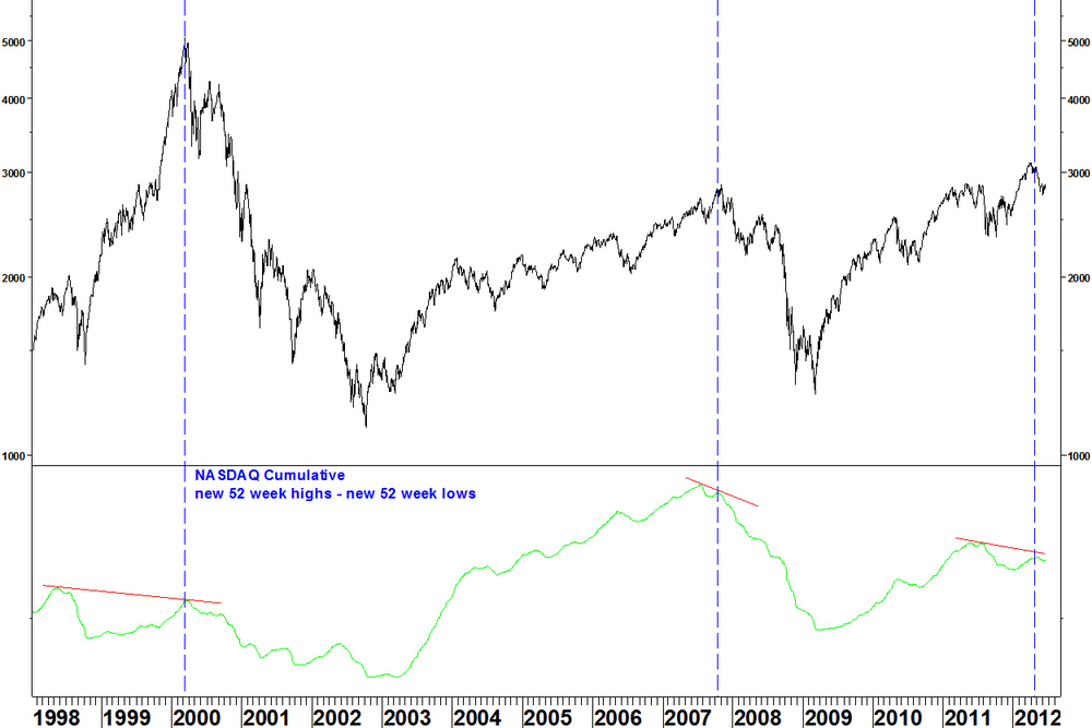
- This indicator showed a divergence in early May and an index decline has followed
- The first non confirmation in the 2003 – 2007 period marked the top
- The first non confirmation since the 2009 low marked a peak. We don’t know for sure whether it marked a long term top yet
- The 1998 to 2000 period is a reminder that not every non confirmation marks a top. It just means that conditions are ripe for a top. You still have to wait for the top to form
Zooming into the recent period
The breadth line peaks one month after the NASDAQ Composite Index, so this isn’t a short term timing tool.
Now compare with the NYSE new highs / new lows data. NYSE Composite Index and cumulative daily new highs / new lows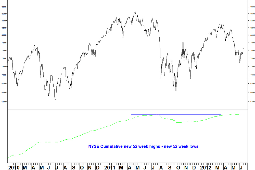
- This spring, the breadth indicator broke above the summer 2011 high despite the index not breaking that high
- There has been a negligible decline in the breadth indicator to accompany the index decline since March
- The reason for this (I believe) is that bond funds are mainly listed on the NYSE, trading as stocks but behaving differently to stocks, therefore spoiling the stock breadth data
I said in May I’d look at the cumulative daily advance / decline series for the NYSE, so here it is.
NYSE Composite Index and cumulative daily advances / declines
- There was a divergence at the 2007 high
- There was also a divergence at the 2000 high (not shown), which like the other divergences at the time, built up over two years
- There is now no divergence
- It would be tidier if there was a divergence, to help confirm the NASDAQ highs / lows divergence. Its absence might also be due to the bond funds on the NYSE
Conclusions
- The NASDAQ highs/ lows indicator has the best record for divergences leading to market declines and this has been confirmed by the action since early May
- The divergence formed at the March high remains the main feature
- A new index high or breadth indicator high (above the summer 2011 high) is needed to negate this and we take it that indices have made long term peaks until that happens
11 June
Here is an update on how some situations identified in previous weeks have developed. Simon Property Group (SPG) v iShares Real Estate (IYR) On 21 May, I showed SPG forming a bearish divergence against IYR on the weekly chart. The requirement on the daily chart was a new high with RSI below 70.
The updated chart shows this is still a possibility. If the criteria are met, a formation break can be taken as the entry signal.
Patni Computer (PTI) v NASDAQ 100 Trust (QQQ) On 28 May, I showed the ratio of PTI v QQQ contracting on its Bollinger bands.I am still waiting for a break above the upper band. This must be an end of week close above the 25 week bands.

U.S. Dollar v Japanese Yen
On 23 April, I showed the USD making a long term moving average crossover against the JPY. These crossovers are indications that something has changed, not exact entry criteria. First, the moving average crossover must be maintained. The MACD on the 30 and 40 week moving average has gone back slightly negative. This must go positive again before we can get interested.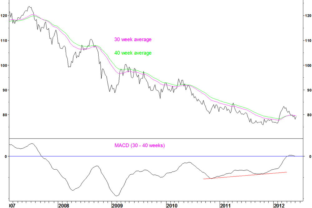
Then, break above a base formation on the daily chart could be an entry signal.
Bonds
On 30 May, I showed that if 30 year bond yields fell further, there could be a bullish divergence on the 14 week RSI. I showed that these divergences were rare and had a decent record of at least halting a trend, often reversing it for a while. A divergence was formed against the September 2011 low at the start of June. Last week, the yield rallied from the divergence. The daily RSI divergence criteria have not been met but there is a choice of one for bond yield charts. Those criteria are for picking the best examples from the thousands of stocks and millions of stock pairs that exist.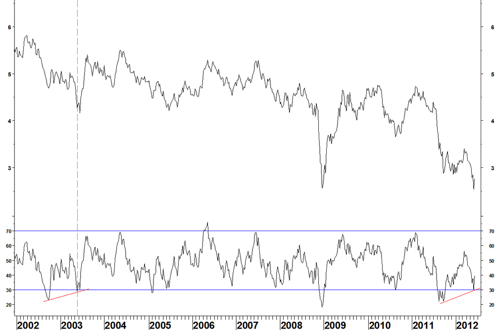
This example lacks a clear entry set up for a short trade on bonds but any long bond positions should be exited.
Research in Motion (RIMM) v NASDAQ 100 (NDX) I got bitten by RIMM once but whilst this has drifted slightly lower, another RSI divergence entry possibility exits. A break above the intervening RSI high for the 14 week RSI would be an entry signal.
The daily chart shows RSI holding above 30, meeting one entry condition.
11 June
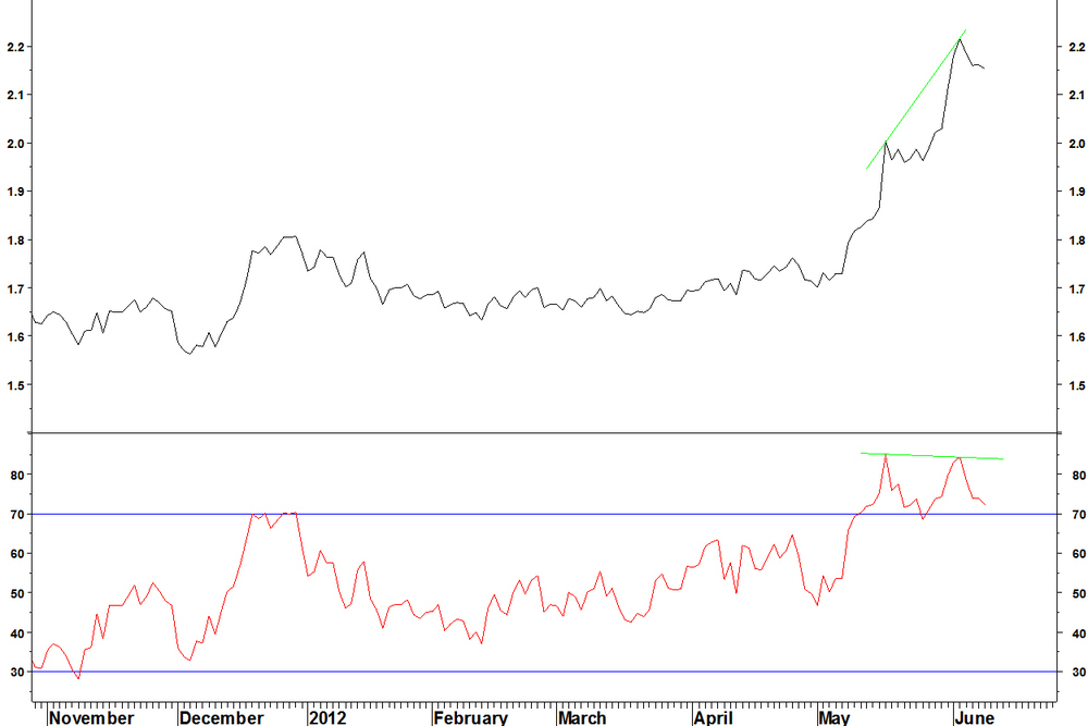
The Coca-Cola Femsa (KOF) v iShares Mexico (EWW) trade continued to move higher.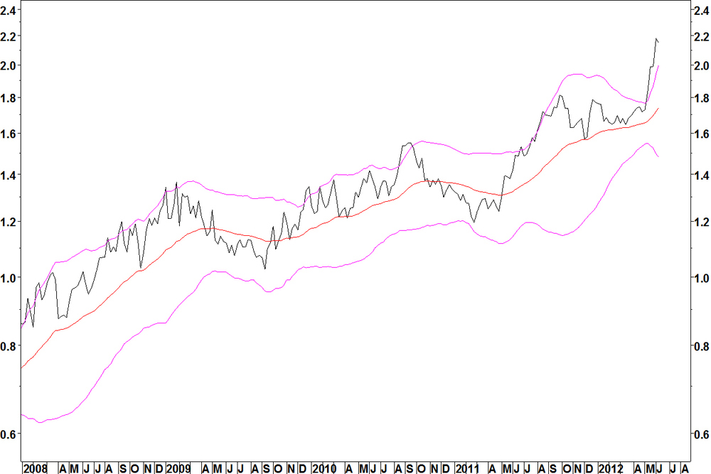
That was until 04 June. It had a divergence on the 14 day RSI, a reason to take more profit.
I don’t use daily RSI divergences to enter positions, only to take profit or as a reason to hold off from entering as position. This might continue higher over the coming months but it might not. I’ve identified the entry, now trade as you see fit.
The SPDR Health Care (XLV) v Teva Pharmaceuticals (TEVA) has shown some profit since entry. Not as prolific as the KOF trade. Again, this might continue higher in the medium term but you should have taken some profit and stop to break even on this by now.
This is a long U.S. short foreign market trade. I am looking at possibilities of opposite trades and by that logic, you might want to take remaining profit on this.
Of the four Bollinger band contractions shown on 14 May, two have failed to give an entry signal (CVD and CSX). One (Novartis) gave its signal and then did not follow through. I said on 28 May that this might be best left. U.S. Steel (X) continued its breakdown.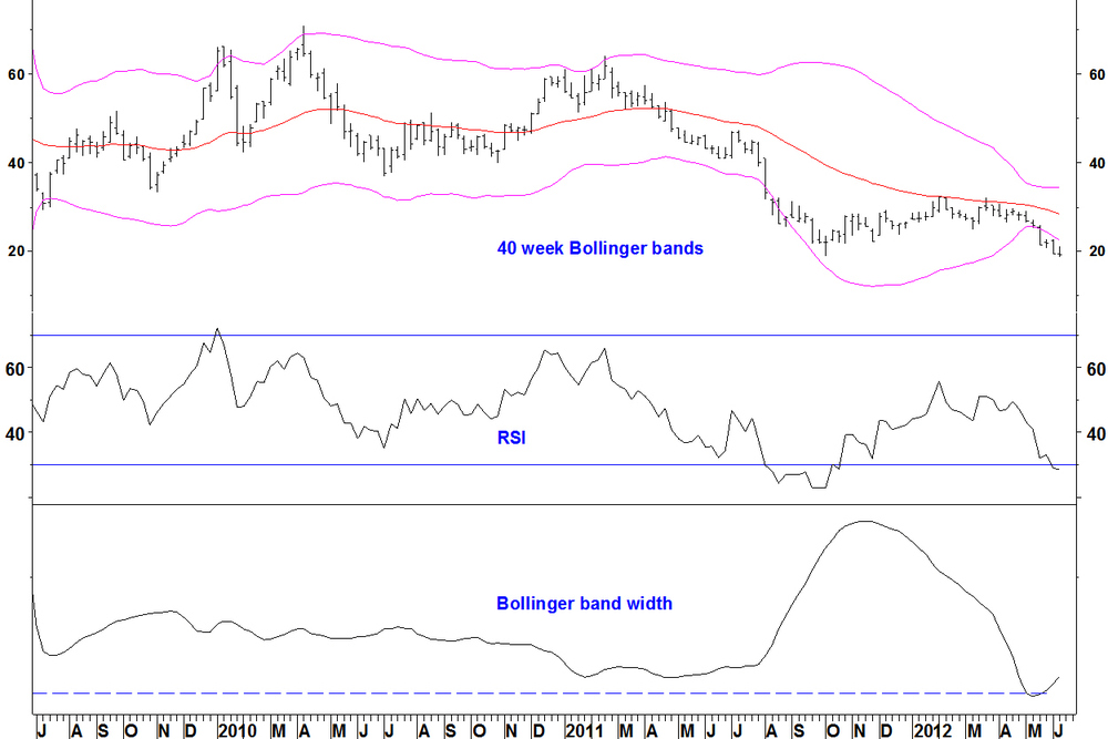
I had given some second thoughts due to the relative strength nearing a bullish weekly RSI divergence. That divergence is now in place properly.
U.S. Steel v S&P 500 Index
So there is some contradiction there that I am aware of. Stocks that lag the market for months, breaking down from contracted Bollinger bands are also those that have weak relative strength, possibly oversold on relative strength, maybe even with a bullish RSI divergence.
There is no single answer to which of these two factors becomes the most important, it all depends on other market factors at the time.30 May
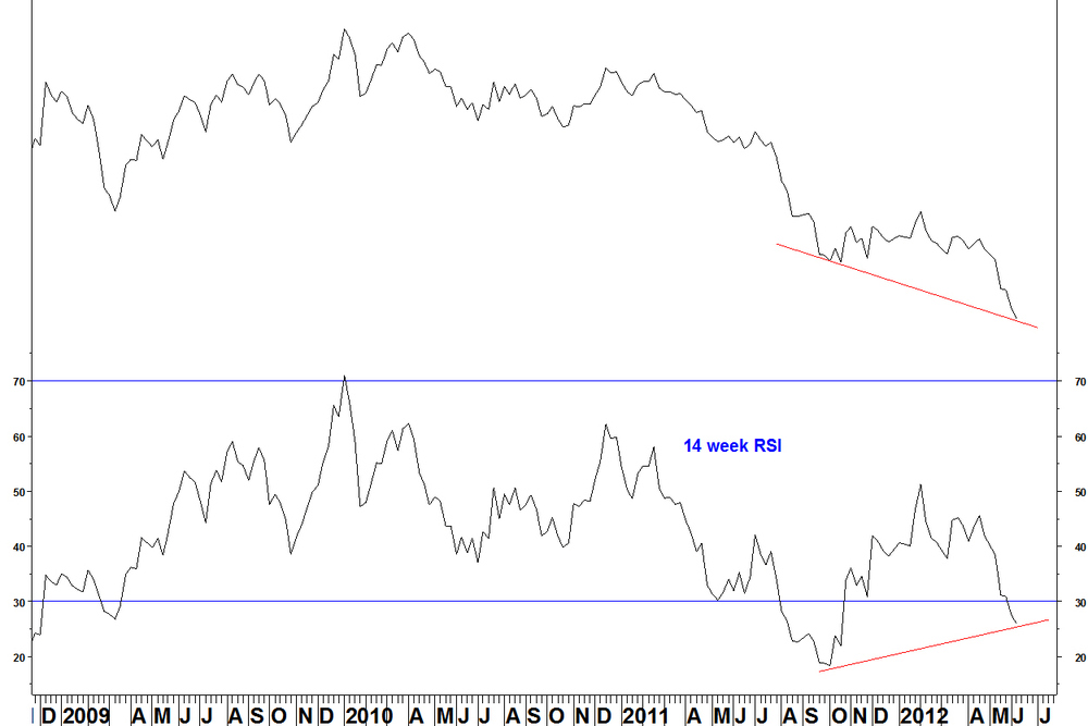
Bond prices are at a high and yields are near their record low, formed in December 2008. Today’s Daily Express front page headline told us that interest rates would be on hold for five years. That relates to UK rates and I will show US rates (that’s the data that I can reproduce) but they have moved closely together for a long time. The chart shows the U.S. 30 year bond yield (TYX) , with the 14 week RSI.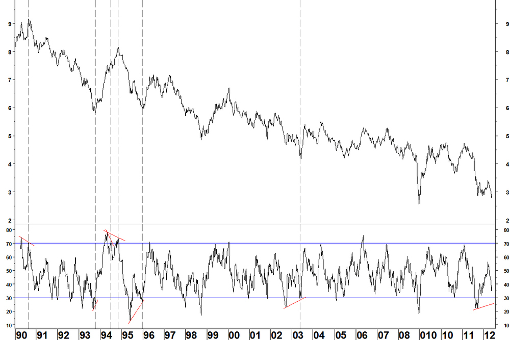
- In August 1990, a high for TYX was formed around 9% on a bearish RSI divergence
- In September 1992, a bullish RSI divergence was formed. This only temporarily halted the rate decline
- In July 1994 the first weekly RSI divergence temporarily halted the decline but the second divergence in early November 1994 really did halt it
- In December 1995 a divergence was formed across troughs (7 months apart) that halted the rate decline
- The next divergence came in May 2003 and this halted the rate decline. Again, this was across troughs, 8 months apart
- There have been no divergences since then
Now, if the rate continues lower, we could get a bullish divergence across troughs, currently 8 months apart since September 2011.
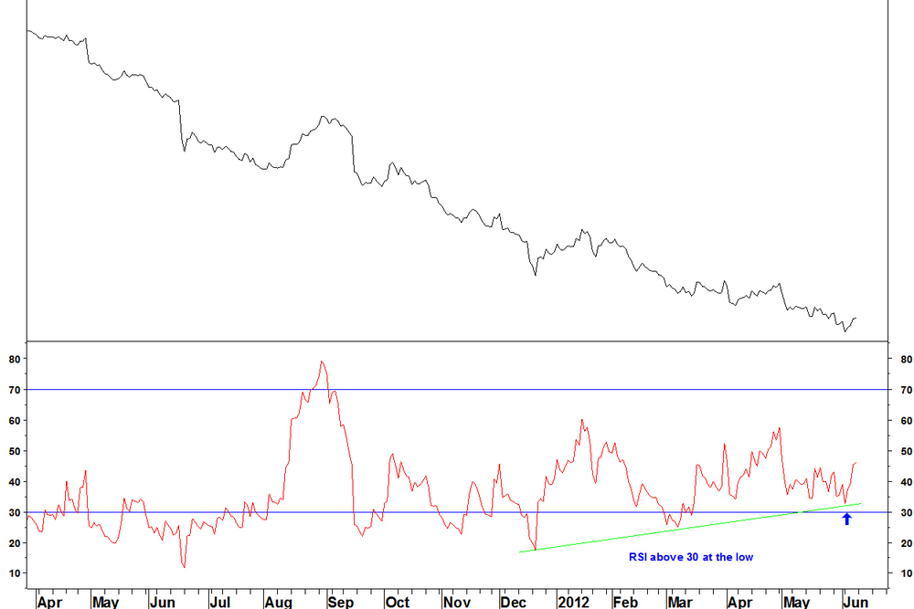
That would then be reason to look for a low in yields and more closely at how to enter that trade. Daily chart
The daily chart also sets up for a bullish divergence.
Regarding my daily RSI criteria, I cannot be so exacting as with stocks to insist on a daily divergence that is above 30, after all, there are not hundreds of yield charts to choose from. Main points- Weekly divergences are rare, with a good record of at least halting a move and often reversing it
- Sentiment allows plenty of scope for a yield recovery
