Here are some examples of divergences setting up according to my new performance ranking method. I’ve ranked performance of the components of the iShares Dow Jones US Oil Equipment Index (IEZ). I show the stock relative to IEZ, along with the RSI of that relative line.
Past example: Baker Hughes (BHI) vs IEZ

- In July 2010 and June 2011, the new relative high is formed with divergences on the 9 week RSI and the Performance Rank (PR)
- Not every low offers a divergence set up, for example, April 2012
- I prefer a 14 week RSI as extreme reading will be rarer but the 9 week RSI worked here
Present example: National Oilwell Varco (NOV) vs IEZ
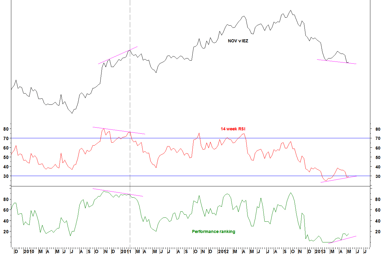
- In February 2011, the relative high is formed with divergences on the 14 week RSI and the PR
- Now, the new relative low is formed with divergences against the February 2013 low
- The 14 week and 14 day RSI set up according to my RSI divergence criteria
Daily chart
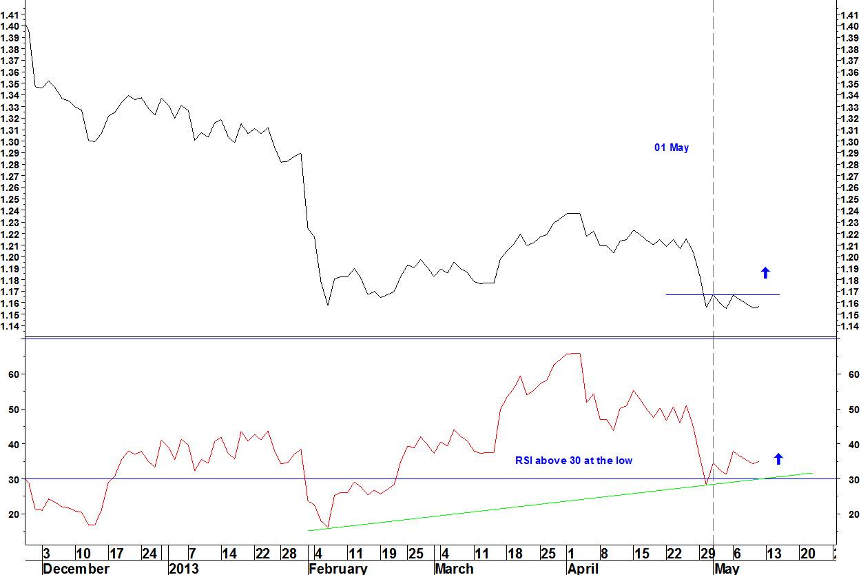
- If the 14 day RSI stays above 30, the buy signal is a move above the small base: above the 01 May high of 1.16691. The stop loss would be a new low
- Check for earnings releases – none upcoming for NOV!
- The position will be opened on an end of day close above 1.16691 with a stop loss as a new closing low. If the relative line moves significantly lower, then it is likely that the daily RSI would go below 30, breaking the daily RSI divergence entry criteria
The ideas from the first performance ranking article can be applied to sector constituents. This will be useful for those having to manage stock weightings in a sector fund, or any group of stocks where a benchmark is available to plot relative strength against.
Example: Anadarko Petroleum (APC) vs SPDR Energy (XLE)

- In late February 2010, APC vs XLE forms a bearish divergence on its 14 week RSI
- Also, the rank of APC within all the components of XLE has dropped from 97 in September 2009 to 87
- The divergence takes another month to play out, with the relative line peaking in early April 2010, still on a bearish RSI divergence. The PR has dropped to 69
- From then, APC strongly underperforms XLE for three months
I have shown how breadth indicators on custom stock groups can be calculated using the Metastock software FIRE. Another capability of this software is to rank performance of a group of stocks.
The best performing stocks will show relative strength against the group benchmark, which could be a market index or a sector ETF. The performance rank (PR) can be charted over time, so I can compare the PR line with the relative strength line.
Example: Dow Jones Food Index
- A set of 70 US sector indices were ranked on price performance
- Performance is ranked over 100 days. The ranking is weighted towards the most recent data: 40-20-20-20 for each 25 day period
- The relative strength line of the sector versus the S&P500 Index is plotted, along with the 14 week RSI of this relative line
DJ Food Index vs S&P500 Index and PR
![]()
- At B (Jan 06), the bullish divergence of the RSI is matched by a bullish divergence on the PR. The sector relative line rallies
- At C (Jul 06), the new relative high is not confirmed by the RSI or the PR. The RSI divergence is not a ‘proper’, as it remains below 70. The sector relative line declines
- At D (Mar 09) and at F (Sep 11), the bearish divergence of the RSI is matched by a bearish divergence on the PR. The sector relative line falls
Also note that:
- At A (May 04) and E (Feb 10), PR was high and the relative fell
Operating principles for performance rank analysis
The FIRE manual suggests buying stocks and sectors showing strength in their PR. This works at times but my observations showed me too many times when a high PR did not persist, times such as A and E on the chart above.
Instead, the PR is most reliably used to substantiate divergences on the RSI of relative strength lines, times such as B, C, D and F above.
Operating principles
- Look for 14 week RSI divergences on relative strength that coincide with divergences on the PR
- The more pronounced the divergence, the more reliable the set up as identifying a turning point
- Use the RSI divergence entry criteria for entering the trade
Where there is not quite a proper RSI divergence (e.g. at C), run stock scans for another side to the trade. Only take the trades with good commonality. Don’t trade a pair that is an aberration just because it fits the RSI divergence criteria
Further observations
- The DJ Food Index had the best record of the 70 sectors of producing good PR divergence signals. This is perhaps because the sector has a consistent relative strength correlation to the market indices (a negative correlation)
- Being defensive, some relative peaks have corresponded with market index lows (times C, D, F). At G (Apr 13), the sector relative also has bearish RSI divergence
- The difference this time is that the PR has dropped but not formed a divergence over a long period. The market index is also not at a low. The set up is not as clear as at times B, C, D and F
Last June, I introduced breadth data for capitalisation groups provided by Pinnacle Data Corp. Then in July, I showed examples of divergences on this data marking turning points. Here is the current situation.
S&P500 Index and %age of stocks above 50 day moving average
- The April 2011 peak had a breadth divergence that built up from October 2010 (6.5 months)
- The October 2011 low had a breadth divergence from August 2011 (3 months)
- The March 2012 peak had a breadth divergence that built up from early February 2012 (2 months)
- The current breadth divergence has been in place since late January (3 months)
- Sometimes, there isn’t a breadth divergence on this indicator (2012) but there is on other breadth indicators
- The current breadth divergence is likely to take its toll soon
S&P500 Index and %age of stocks above 100 day moving average

- This longer period moving average breadth indicator had its first divergence on the 11 April high
- By 18 April, breadth was the lowest this year
- Although price has almost reached its 11 April high, breadth has not and this is replicated across breadth indicators for other market capitalisation groups
Cumulative breadth divergences
On 16 October, I showed a divergence on the cumulative advance-decline line for the S&P100 Index. This divergence has now been blown away.
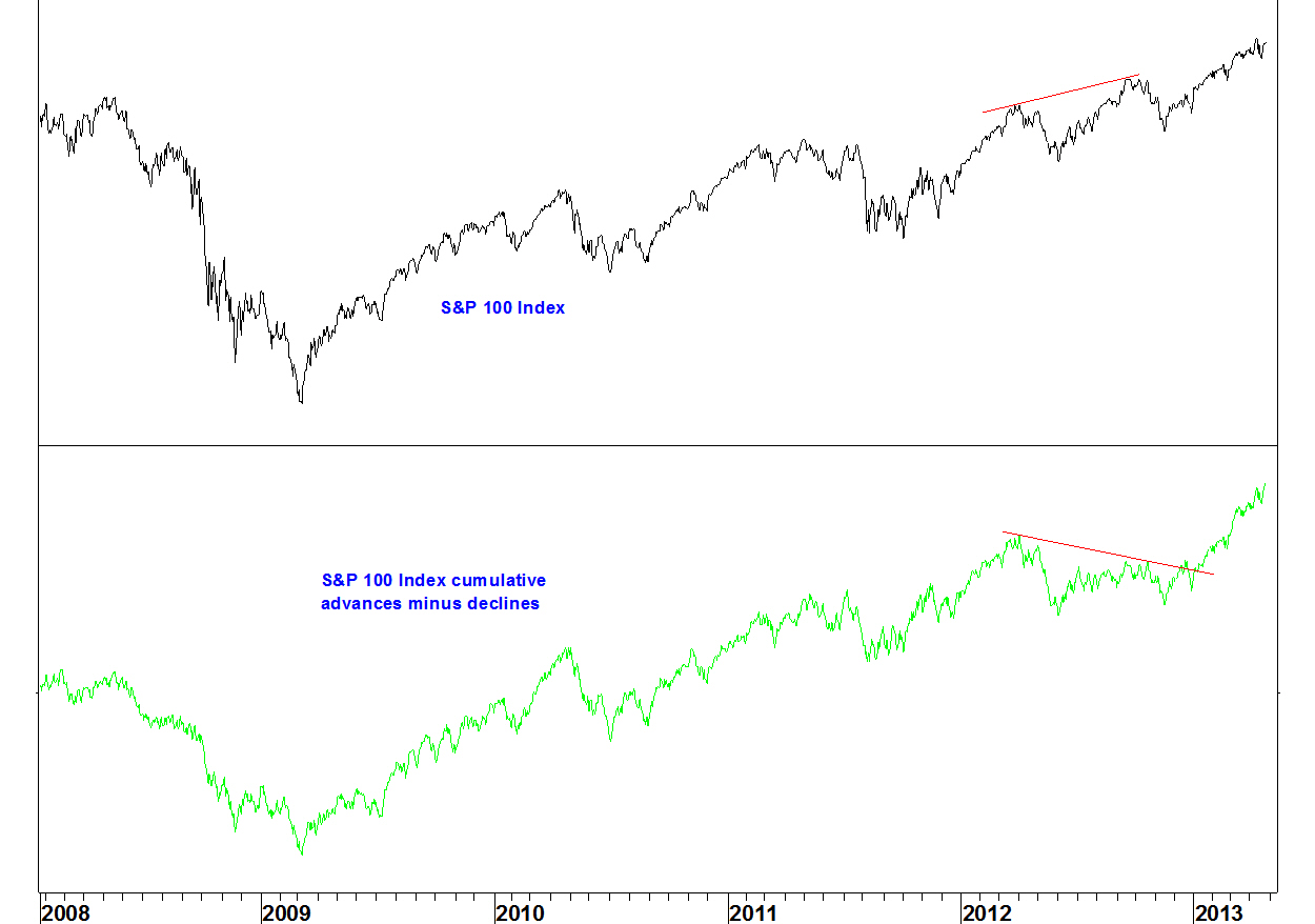
I said at the time that there were other breadth indicators not showing divergence. These can only be used as a warning, not a timing device. Using in conjunction with the moving average breadth charts will help, along with confirmation from RSI divergences on the indices.
As well as publishing the newspaper of its name, The Washington Post Company provides education and training services.
WPO has been in a long term downtrend against the SPDR Consumer Discretionary (XLY). The 12 and 26 week moving averages crossed in March 2009 and did not cross again until February this year.
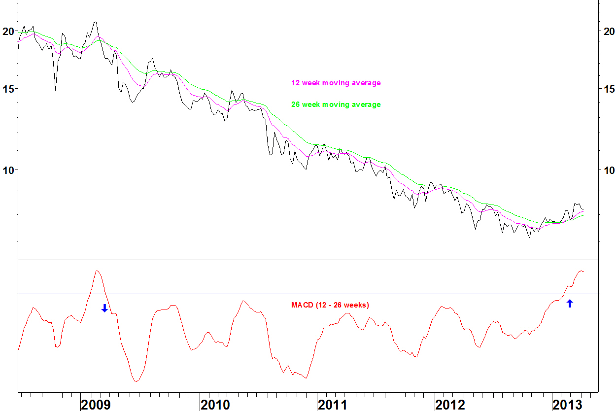
In my moving average crossover method, I ideally look for cases where the averages have not crossed for four years. This is one month short of that mark.
The late 2011 MACD low was a bullish divergence but it required more divergences in May and October 2012 before the low was seen. Waiting for a moving average crossover is a safer tactic than picking divergent lows.
Daily chart
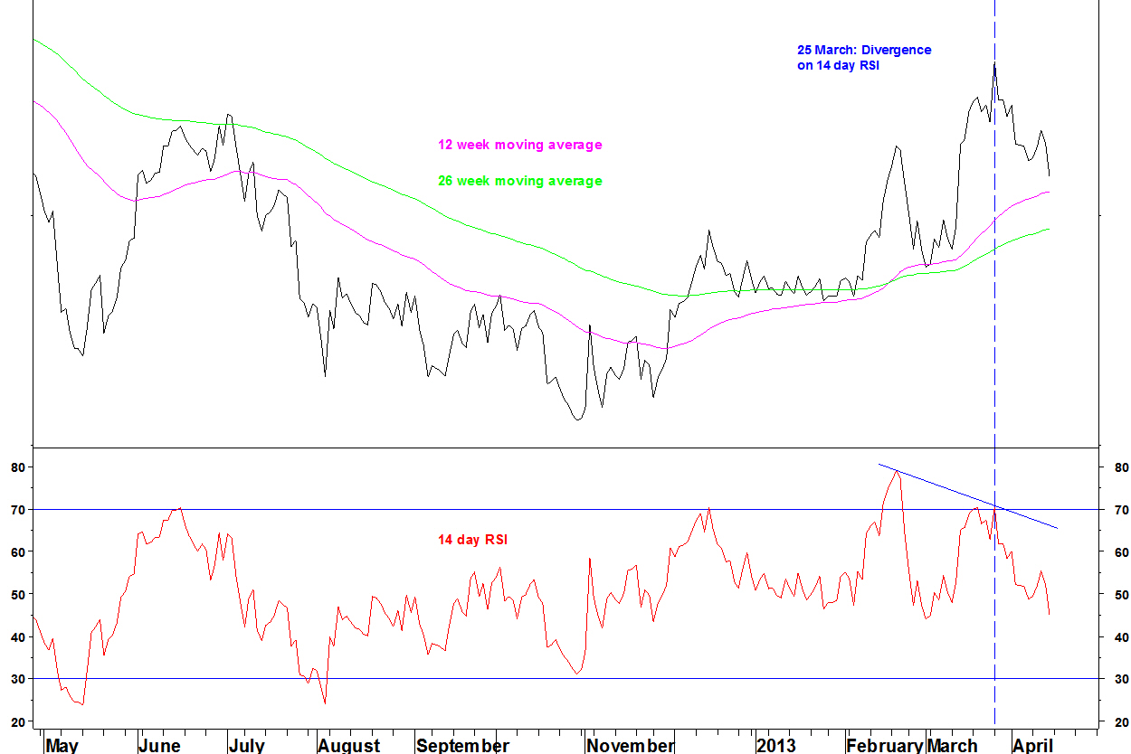
Following the 19 February crossover, the ratio formed a bearish divergence on the 14 day RSI on 25 March. As mentioned earlier today, bearish daily divergences can be used as a reason to take a position off, or delay putting it on. Since 25 March, the ratio has pulled back 5.8% towards the moving averages and the RSI is mid range.
Summary
The long term moving average crossover signals that the underperformance of WPO is over. A new trend of outperformance may have started and with the short term ratio having unwound, now is the time to go overweight WPO in a sector portfolio.
In the last few months, I’ve been looking for some RSI divergence set ups that have not materialised. By using entry criteria, both in terms of being ready to pull the trigger AND then actually pulling it, I can avoid calling trend changes too early.
Example 1: Gold stocks
In my 25 February post, I was looking for an oversold condition on gold stock breadth that lasted until at least late March. This was achieved but entry criteria, such as what existed for Pan American Silver (PAAS) in July 2012 have not been reached on any gold stocks, on price or relative to the S&P500 Index. Newmont Mining (shown on 25 February) failed to set up on its daily chart and the weekly set up then failed
Gold has accelerated downwards and acceleration is usually an ending signal of some degree. Picking lows without momentum divergence is not one of my methods though.
Example 2: Sector RSI divergences
Also on 25 February, I was looking for bearish RSI divergences on several sectors, including the Biotechnology sector, which has continued to power ahead.
The RSI divergence entry criteria, stated on my methods page, state:
- Entry signal is a weekly close of the RSI above (or below for tops) the intervening high
- At times, a weekly bar reversal can be taken as an entry signal. This will depend on other confirming factors
Either way, no entry signal was given and these trades were avoided.
Similarly, the RSI and breadth divergence set up described on 18 February had a stated position entry of a weekly close below $43.09, which was never achieved.
Summary
By defining set ups and entry criteria, based on observation of what has been most reliable in the past, most of the time you can avoid picking trend changes too early.
Postscript
If I had followed the Bollinger Band breakout on the MS Consumer Index (CMR) v MS Commodity Related Equity Index (CRX) of 25 February, then including today’s action, this trade would have a gain of 13.2%.
The blog has taken a bit of a back seat recently: Easter and trying to get an end result from this work. Today I’ll update on some calls of the last few months and make some new ones.
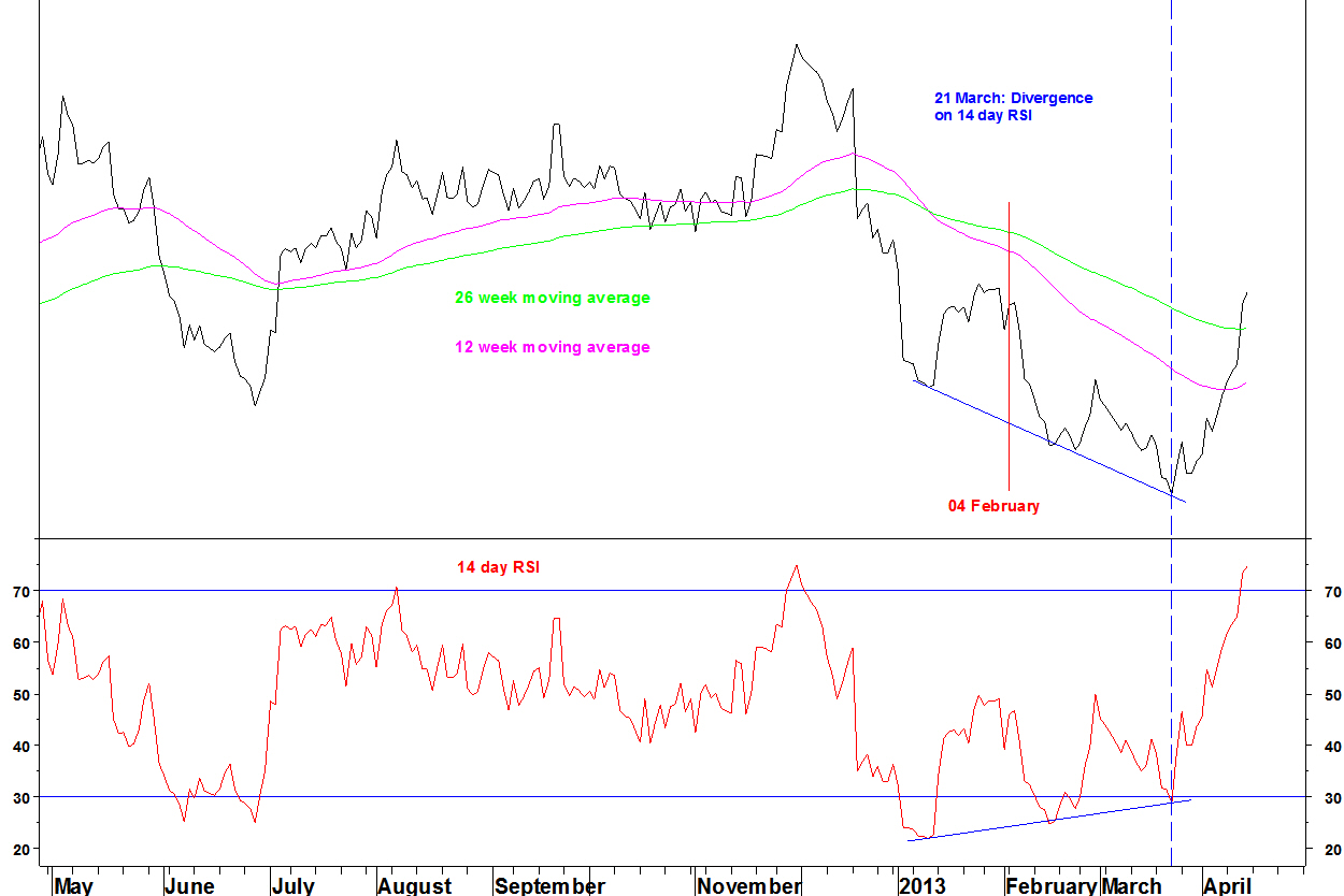
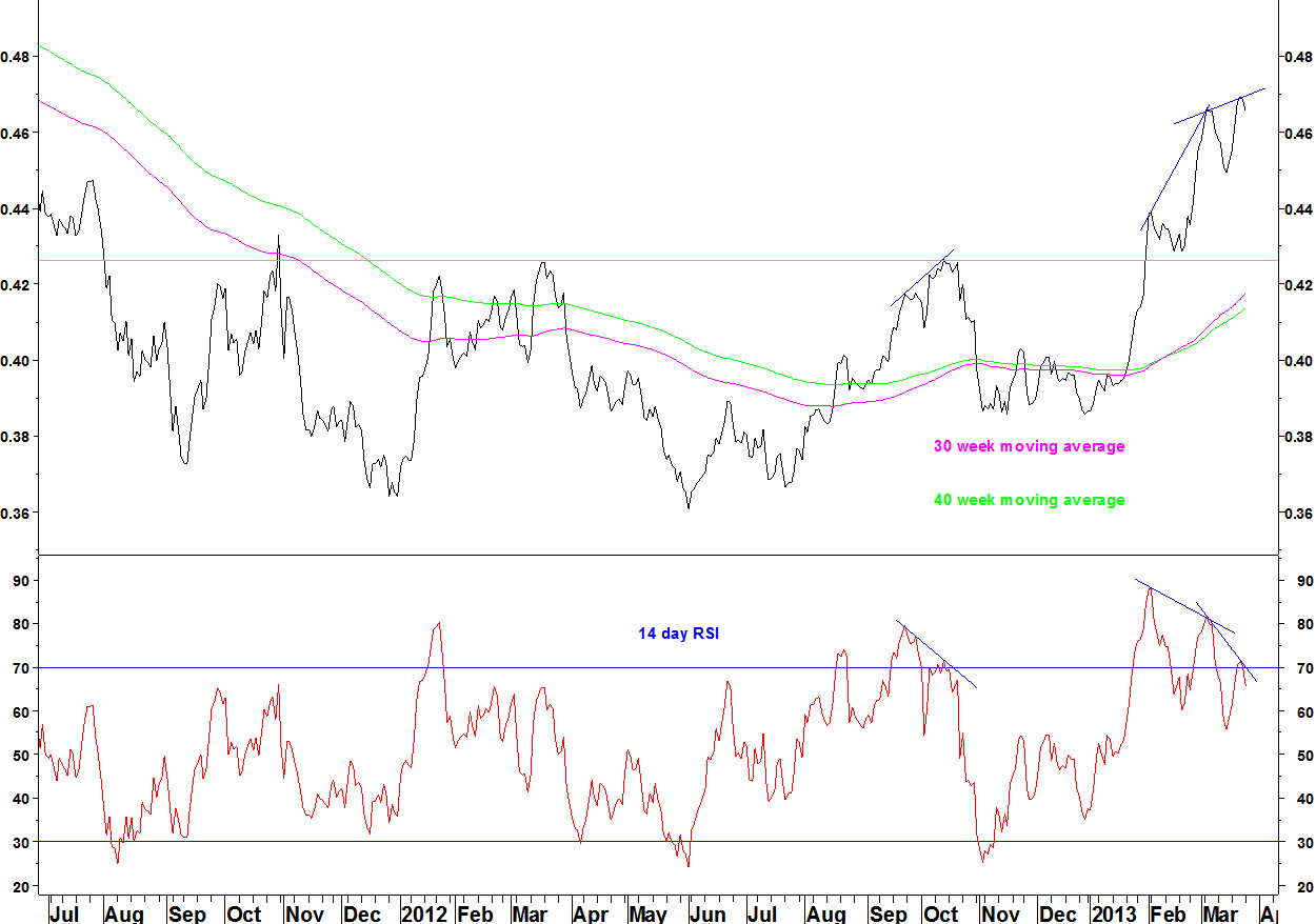
On 26 March, I showed the base forming on the pair of Kimco Realty (KIM) against Post Properties (PPS).
Daily chart
I showed the RSI divergence on the daily chart and suggested that this might be the point at which the ratio pulls back into the base. One last high was in fact made on 02 April but since then, the ratio has pulled back. To restate from 26 March:
Ideally, the ratio will pull back to near the top of the base and the moving averages, somewhere around 0.43 to 0.44. Given that this is a long term trend change, the unwinding from short term overbought may be more in time than price.
There are no precise entry criteria for these long term moving average crossovers. They are more suited to setting stock weightings within a long only fund than as well defined pairs trades.
The use of daily RSI divergences
Daily RSI divergences are not reliable enough as entry criteria (that requires weekly divergences) but they can warn against an action, or be used as an excuse to close a position. Here is another example with Limited Brands (LTD).
Limited Brands (LTD) v S&P500 Index
This moving average crossover was shown on 04 February. There has not been a cross back over, which would take a long time to achieve and would be a clumsy exit signal. Nor was there a weekly RSI divergence to signal a rally in the ratio.
The 14 day RSI however did show divergence in late February, leading to a short term rally, then another divergence at the low on 21 March.
Summary
Daily RSI divergences often lead to pullbacks in a trend, sometimes sizeable and it is a good idea to let such a divergence unwind before entering a longer term position.
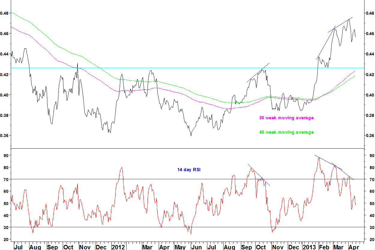
Between 2009 and 2012, Kimco Realty (KIM) was in a downtrend against Post Properties (PPS). KIM is a retail Real Estate Investment Trust (REIT) and PPS is a residential REIT.
During 2012, the ratio based and in early February, the 30 week moving average moved above the 40 week moving average for the first time since February 2009.
In my moving average crossover method, I look for crossovers following a long time since the previous cross, preferably four years. This example is just a few weeks short of that.

The 14 week RSI has now formed a bearish divergence, so the ratio is vulnerable to a pullback towards the moving averages.
Daily chart
The ratio is on its second daily RSI divergence. The early March divergence led to a pullback, as did the October 2012 divergence.
I expect the pullback that started yesterday to continue over the coming weeks. Ideally, the ratio will pull back to near the top of the base and the moving averages, somewhere around 0.43 to 0.44. Given that this is a long term trend change, the unwinding from short term overbought may be more in time than price.
There are no precise entry criteria for these long term moving average crossovers. They are more suited to setting stock weightings within a long only fund than as well defined pairs trades.
04 March
Here is how some ideas from recent weeks are developing.
I showed the Morgan Stanley Consumer Index (CMR) v Morgan Stanley Commodity Related Equity Index (CRX) breaking higher from a Bollinger Band contraction. That break continues.
The coal sector underperforms the S&P500 Index and the SPDR Energy (XLE). That downtrend continues but I am looking for bullish divergences on weekly RSI and MACD soon, for a relative buy point for coal stocks.
Dow Jones Coal Index v SPDR Energy (XLE)

Gold stock breadth (on the 16 components of the Philadelphia Gold & Silver Index), as measured by the %age of stocks below their 200 day moving average is oversold.

I showed that historically, breadth is first oversold at least five weeks before the price low. Breadth reached zero on 20 February, so let’s look around the end of March.
Two weeks ago, I showed Newmont Mining (NEM) possibly forming a bullish divergence against the S&P500 Index. That divergence has been blown away and we’ll have to wait for another relative RSI divergence buy set up. No other gold stocks shows such a set up either.
Last week I shows some sector RSI divergences. The divergence on the Biotech sector is still in place even though price has moved higher.

Remember that the best RSI divergence trades meet criteria on the weekly and daily chart as described here.
The SPDR Health (XLV) still has weekly RSI and breadth divergences. Not much has changed on that chart.
XLV and %age of component stocks above their 100 day average

So in summary, still a waiting game on these set ups.
25 February
Last week, I showed a sector pair that was poised to break higher from a Bollinger Band contraction. It promptly broke higher with Friday’s close. Morgan Stanley Consumer Index (CMR) v Morgan Stanley Commodity Related Equity Index (CRX)
- The 40 week Bollinger Bands were their tightest for three years
- The 40 week moving average trends up
- The upper band was broken on an end of week basis and there was an expansion of the band width
The CRX is quite a strange index, not really representative of the commodity space by market cap. This page describes it. Last week’s decline owes something to precious metal stocks and for those and coal stocks, I am looking eventually for relative buy opportunities. So there is a contradiction here and I will pass up on the trade.
Weekly RSI divergences form on sector charts S&P Biotechnology Index
Dow Jones US Home Construction Index

S&P Media Index

These charts have daily RSI divergences to some extent, within these peaks or against their October 2012 peaks.
The weekly RSI divergences are supported by MACD divergences and having many sectors with bearish divergences strengthens the case for a market pullback.
