03 September
Of the ideas reviewed last week, one has given its entry signal and that is the Bollinger Band breakout on the pair of Goldman Sachs (GS) v iShares Brazil (EWZ). This has now given an entry signal according to my Bollinger Band criteria.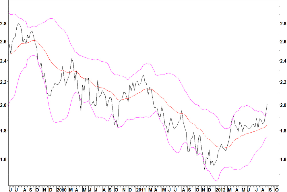
- The ratio formed a base in late 2011, rallied and consolidated since late March
- This consolidation allowed the 25 week Bollinger Bands to contract to their tightest in three years
- The 25 week moving average has turned higher
- The ratio broke above the upper band in week ending 24 August
- The expansion of the band width occurred last week, that is the entry signal to be going long GS, short EWZ
Daily chart

- The daily chart shows the ratio has broken resistance since March
- The stop loss is below the consolidation that preceded the breakout, at the red line at 1.83
- This is a medium term position (weeks to months), so it could pull back a bit in the short term. However, the best examples of these trades do not pull back far or for very long
27 August
I returned from holiday intending to move on to the next stage of marketing myself: finding suitable funds to contact. However, I found myself wanting to catch up with the market. I want to continue with ongoing coverage of previous recommendations and add a few new ones, although less time must be spent on that. Two weeks later (Monday each week), I’m still looking at trade ideas not contact lists. That’s a good example of what I am like. I’m far happier getting stuck into my analysis than networking and contacting people. Anyone employing me will need to understand that to get the best out of me, they should let me focus on the analysis. Anyway, here are the other trade ideas I have found. Moving average crossover method trade ideas Long utilities, short auto retail In my methods, I say that averages should not have crossed for at least two years, preferably four years. Getting four years without a cross is quite hard, but there is enough commonality in these pairs across the utility stocks to suggest that a long term rotation in favour of utilities, away from auto retailers is taking place. Remember that these are long term rotations and not exactly timed entry points.- These pairs were set up with a 12 and 26 week moving average
- Many show bullish crossovers, following bullish divergences on the MACD indicator
Use the following stocks on the long side:
Edison Intl (EIX)Entergy Corp (ETR)
Exelon Corp (EXC)
Nextera Energy (NEE)
PG & E Corp (PCG)
Public Service Enterprise (PEG) Use these stocks on the short side: Autozone (AZO)
O’Reilly Automotive (ORLY) Bollinger Band contraction idea The pair of Goldman Sachs (GS) v iShares Brazil (EWZ) is setting up according to my Bollinger Band criteria.
- The ratio formed a base in late 2011, rallied and has consolidated since late March
- This consolidation has allowed the 25 week Bollinger bands to contract to their tightest in three years
- The 25 week moving average has turned higher
- The ratio has now broken above the upper band and you should look to be going long GS, short EWZ
- The entry criteria includes an expansion of the bands, which has not yet occurred
- Watch this week for an expansion of the band as an entry signal, along with the ratio continuing to make upside progress. Today, the ratio is up by around 1.7%, so that is a good start
27 August
As I explained one month ago, I will keep the blog ticking over but put more time into the next stage of the project. Some of the ideas posted in previous blogs have not met their entry criteria yet. They are:- iShares Consumer Goods (IYK) v iShares Malaysia (EWM): This was posted as an entry on a Bollinger band breakout, which has yet to occur
- US Dollar v Japanese Yen: This was posted as a long term moving average crossover and the entry criteria of a break above 80.44 has yet to occur
- Simon Property Group (SPG) v iShares Real Estate (IYR): This continues to trade sideways
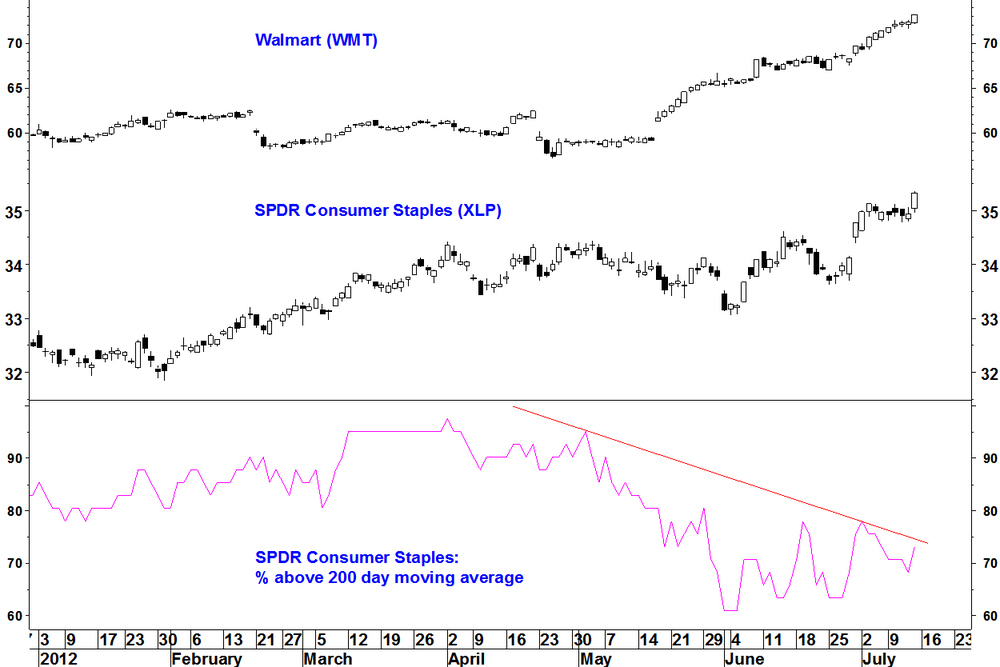
On 16 July, I showed the breadth divergence on the SPDR Consumer Staples (XLP). Here is an update.
The breadth divergence remains in place. XLP has pushed fractionally higher since mid July and the %age of stocks above their 200 day moving average has moved higher to 80% (33 out of 41 stocks).
It is not true that as soon as a divergence exists, price will fall, more that conditions are right for a fall. Breadth divergences mean you should continue to to watch for signs of a reversal. There has been a weekly reversal on XLP, making a new high (although not opening higher) and then finishing down on the week.

This also occurred several other SPDR sector ETFs. This will mean there were a lot of buying climaxes this week and clusters of buying climaxes can accompany tops. Another down week for XLP, particularly if it closes below last week’s low would increase the chance that a top has occurred.
23 July
I’ve now got some good examples on this blog of the various trade ideas described in my methods section. Over the next few months I will:- Finish off setting out what I can do with FIRE, my new breadth software, showing you what I can provide as a customisable breadth product
- Have a break in early August
- Start researching hedge funds and institutions to approach
This will mean less time on finding and showing examples of my trade types but I have done that now. I will keep the blog up to date in terms of monitoring trade ideas previously shown. Below is this week’s update.
Allergan (AGN) v Cigna (CI) This was set out two weeks ago. The ratio had pulled back a bit too far for a Bollinger Band breakout, which ideally has brief, shallow pullbacks as the breakout is maintained. I was looking to buy a reassertion but none has occurred. Allergan has been weak and against the S&P 500 Index, breaking down from a Bollinger Band contraction, so it now not a candidate for the long side of a pair. Abandon this trade idea. Allergan (AGN) v S&P 500 Index
iShares Consumer Goods (IYK) v iShares Malaysia (EWM)
This continues to consolidate within its Bollinger Bands. Watch for a breakout. Simon Property Group (SPG) v iShares Real Estate (IYR) This has traded sideways over the last few weeks but I continue to watch for a breakdown as described on 09 July. US Dollar vs Japanese Yen An end of week close above 80.44 was set as the level at which a long term moving average crossover would look more likely. Over the last few weeks, price has drifted slightly lower, This is just one to keep monitoring.16 July
So much for historical examples, what about a current breadth divergence identified using FIRE? Here it is. The SPDR Consumer Staples (XLP) has 41 components. The chart shows the major breadth divergences between price (top window) and the %age of components above their 200 day moving average (bottom window). SPDR Consumer Staples (XLP) and 200 day MA breadth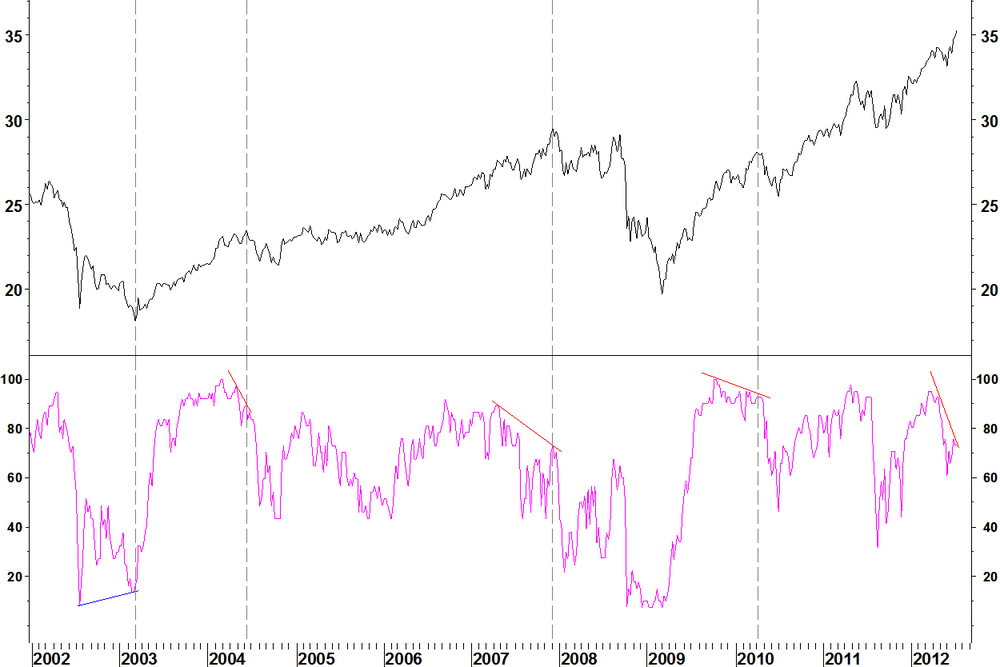
- In March 2003, a new price low forms with a bullish divergence
- In June 2004, a bearish divergence forms. The setback is quite minor and lasts until October. As with XLY at this time, the first divergence in April does not mark the high. Not every divergence is a top
- In December 2007, a bearish divergence forms. This is a bigger divergence than in 2004 and marks the top
- In April 2010 a divergence forms and a 10 week pullback follows but new highs are formed
- In July 2012, a bearish divergence forms. There is quite a significant drop off for the breadth indicator: from 95% in early May to 73% now. Here is a closer look
- Breadth fell to 61% at the early June low but in the recovery for XLP, the breadth rally has been minimal
- This can occur if highly weighted components are advancing whilst smaller components are falling
- In this case, Walmart (WMT), the 4th largest component, has rallied strongly and Proctor & Gamble (PG), the largest component has rallied since late June
Which stocks are failing?
The following stocks have fallen below their 200 day moving average since early May: ADM, AVP, CAG, EL, HRL, KR, SWY, TAP, WAG. These are mostly lower weighted components of XLP. You can review those yourself if you like. The exercise of trying to keep track of the market by taking in the action of 100s of stocks in your head is futile. Stick to a top down approach to make sense of things. Summary XLP is being held up by a few high weighted components. This is unsustainable and will be followed by at least a pullback, maybe a top. The breadth data does not tell us exactly when that will occur, just that conditions are ripe for a correction.Other breadth series that can be calculated using FIRE will be covered in future weeks.
16 July
I’m now able to show you what FIRE, my new Metastock add-on can do. FIRE allows the creation of breadth indicators on custom stock groups. Most breadth data available is across whole exchanges such as the NASDAQ, or for capitalisation segments like mid cap stocks. This includes data from Pinnacle Data Corp, which I have shown you in previous weeks. If however your interest is a particular group of stocks, maybe that comprise a sector or country ETF, then FIRE comes into its own. With FIRE, I can identify rare, high probability turning points from breadth divergences. I can do this for you, on your stock groups! FIRE allows the following type of breadth indicator to be created: Range bound indicators- Moving average breadth: The number or proportion of stocks above their moving average. Set the MA period to whatever you want.
- Moving average crossover breadth: For rising stocks, a shorter period moving average is above a longer period moving average. See the number or proportion for any MA combination.
Cumulative indicators
- Cumulative advancers minus decliners (an advance-decline line)
- Cumulative new X day highs minus new X day lows (for example, for a new 52 week highs – 52 week lows line). This was the indicator found most useful on the exchange wide breadth data
- Cumulative advancing volume minus declining volume. This will be biased towards the higher market cap/ lower denomination stocks
Other indicators, such as McClennan Oscillators, ARMs Index are available. I will stick for the most part to following:
- Moving average breadth
- Cumulative advancers – decliners line
- Cumulative new highs – new lows line
Examples of moving average breadth divergences found using FIRE
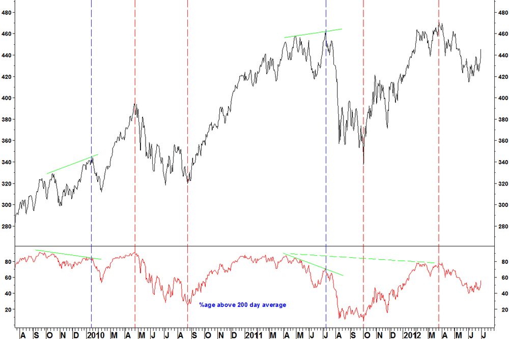
The SPDR Consumer Discretionary (XLY) is an ETF with 81 components that has traded since late 1998. The chart shows the major breadth divergences between price (top window) and the %age of components above their 200 day moving average (bottom window). SPDR Consumer Discretionary (XLY) and 200 day MA breadth
- In March 2003, a new price low forms with a bullish divergence. The first bullish divergence in October 2002 offered temporary reprieve but a new low was made in March
- In April 2004, a bearish divergence forms. The setback is 10.9% over four months. This divergence takes a while to kick in. The February and March divergences did not prove the top, so beware, not every divergence is a top
- In June 2007, a bearish divergence forms. This is a bigger divergence than in 2004 and marks the top
- In July 2008, a bullish divergence forms and the ETF rallies but not every divergence is a long term turning point and new lows are formed
- In March 2009, the low is formed on a divergence
- There are no bearish divergences until July 2011. That marks a peak, until new highs are made in early 2012
- In April 2012, a bearish divergence marks a peak. This is a very minor short term divergence (easily missed) but more significant is the divergence across peaks to previous years. This shows a longer term drop off in participation in the bull market since 2009
So there are important turning points picked out by this data but the caveats are:
- Not every divergence marks a turning point
- Not every turning point is a long term peak or trough
- Other factors, such as market cycles decide the above
- Breadth divergences coinciding with RSI divergences are stronger candidates
This blog shows the value of breadth divergences and in the next blog, I’ll show some current examples.
09 July
As I referred to in today’s earlier blog, scans for trades meeting my entry criteria can be directed by a market viewpoint or even a possibility. Then, if that works out, the trades you have found that match your entry criteria will work out. iShares Consumer Goods (IYK) v iShares Malaysia (EWM)
This pair fits the Bollinger Band entry criteria.
- Band width has reached the tightest in the last three years
- The chart has a clear moving average direction (up not sideways) and a breakout in the direction of the moving average will be bought, if given
- The entry criteria are a break of the upper band on an end of week basis, with an expansion of the band width
Daily chart
- Such a break will likely clear resistance
- The stop loss would then be below the late June low
Allergan (AGN) v Cigna Corp (CI)
The second example is a health care pair. This has already broken the upper Bollinger Band, which was at its tightest for over three years. The breakout is in the direction of the moving average.
Daily chart

A consolidation that began in late December was recently broken.
The ratio has pulled back by almost 3% today and I wouldn’t want to see too much more of a pullback. Good examples of these breakouts don’t hang around either in time or price once the break has occurred.
A proper write up of FIRE, my new breadth package will come next week, when I get a clear week to look at it.
09 July
This is an update on some ideas I have been watching.Patni Computer (PTI) v NASDAQ 100 Trust (QQQ)
This continues to consolidate between Bollinger bands. However, I am now not so sure that this will resolve to the upside, or that even if it does, that it will be sustained.
In my methods section, I discussed some cycles work that I follow. This does not offer a good backdrop for an emerging market outperformance trade now, neither from the market index or US Dollar perspective.
I have to leave it as that, as it is not my work to reproduce but the point is this: By selecting the best of the other commentary that is out there, I can get some perspective on my output and use it as a filter on my results. Also, it can direct the stock scans that I run, looking for examples that meet my criteria on series that are most relevant to that other commentary. US Steel (X) v S&P 500 Index On 11 June I wrote that I the bullish RSI divergence on this may bring about a rally, which proved to be the case. Given what I’ve said above, I wouldn’t chase this now for further upside.
US Dollar vs Japanese Yen
This still needs to break above its short term base. An end of week close above 80.44 would increase confidence that this long term turn is taking place.
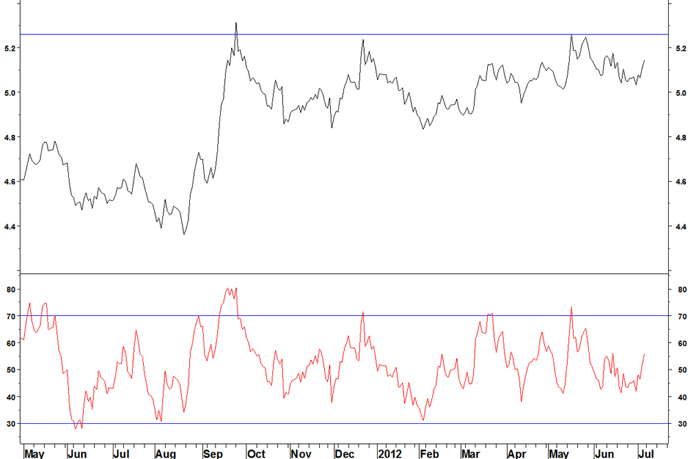
Simon Property Group (SPG) v iShares Real Estate (IYR)
This gave a false signal a few weeks ago you may recall but the new high gives another bearish weekly RSI divergence.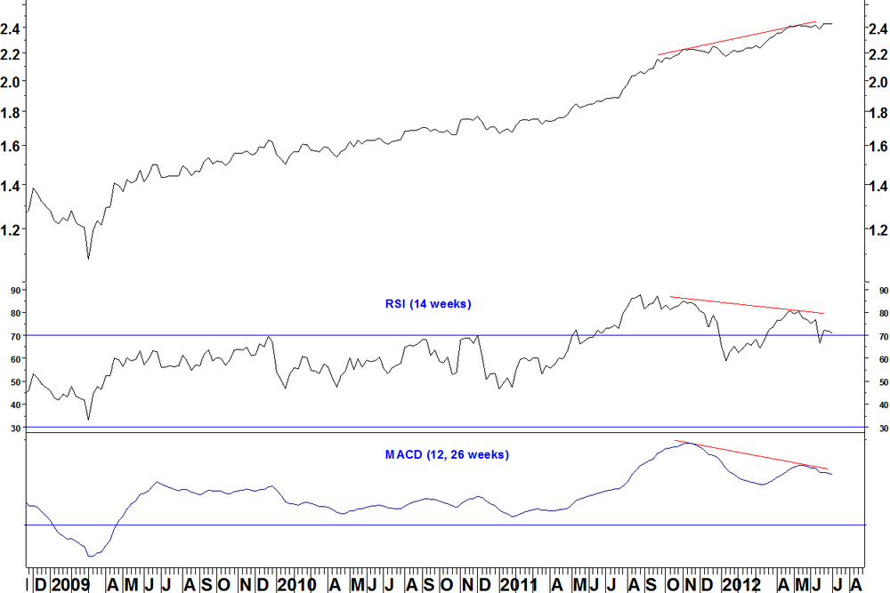
The daily chart now has a new high with the RSI below 70. Another entry signal could be below the blue line or even below the 18 June low.

04 July
I think that I should revise, or at least change the emphasis of what I said on market breadth last week, specifically in terms of putting more weight on the NASDAQ High/low indicator than the NYSE cumulative breadth indicators. My reasoning was that bond funds distort the NYSE indicators and those have been strong recently, which may have caused the new highs for those cumulative indicators. That is true but I don’t think I gave enough attention to the status of the breadth indicators for the different capitalisation size groups, which I first had a proper look at last week. These are not distorted by bond funds. In the article of 25 June, I stated that using the High/low cumulative breadth indicator, the large cap breadth indicators (S&P 100, NASDAQ 100, S&P 500, Russell 1000, even the mid cap S&P 400) confirm the market index advance. The same was true for the advance/ decline cumulative indicator. So that is the top 1000 stocks by market cap not showing a divergence, quite a long way down the list of stocks. The situation with the small cap section isn’t a divergence, as the small cap index does not make a new high. The small caps not keeping pace with the indices is an issue worth noting, but not as decisive as I originally suggested. Think back to the last leg of the last bull market between mid August 2007 and late October 2007. Then, only 3 of the 10 S&P broad sectors (energy, materials, technology) participated in that index rally. Financials went sideways at best, the other six made tiny gains. Then, think back to February/ March 2009. The financials made new lows along with some consumer stocks but energy and materials and many stocks from various sectors made higher lows, above their 2008 lows. These were proper breadth divergences and we don’t have anything like that now. I follow the cycles work of Tim Wood and he discusses how cycles tie in with breadth divergences. He points out that breadth divergences accompany the type of cycle top that he focuses on the majority of times. This does leave room for times when these tops form without breadth divergences. Summary The NASDAQ Highs/ lows breadth divergence is worth noting but there is not one of those truly rare times, like in October 2007 or March 2009 when breadth is clearly diverging with the market index, giving us a high probability entry point.Moving average breadth indicators for market cap stock indices
02 July
Following on from last week, I’ll show what moving average breadth indicators from Pinnacle Data Corp reveal. To recap, moving average breadth indicators show the percentage of stocks above a moving average. These indicators are helpful when:- There is a track record of forming divergences at turning points
- Overbought and oversold levels remain fairly constant over time, allowing us to predict at least a pause in the market’s trend
This is not true for all the indicator series. What I show you can be filtered for those with decent predictive track records and then showing them at particularly important times.
There are five indicators calculated over eight market cap segments. They are: NASDAQ 100 IndexRussell 1000 Index (large cap)
Russell 2000 Index (small cap)
Russell 3000 Index (the two above combined)
S&P 100 Index (100 largest cap stocks)
S&P 500 Index (large cap)
S&P 400 Index (mid cap)
S&P 600 Index (small cap) For each segment, the following breadth indicators are available: %age of stocks above their 21 day moving average
%age of stocks above their 50 day moving average
%age of stocks above their 80 day moving average
%age of stocks above their 100 day moving average
%age of stocks above their 200 day moving average Here are some examples of how the data looks and when it is most useful.
S&P 600 Small Cap Index and %age above 200 day average
- In January 2010, a divergence on the indicator, developed since the previous September, marks a high
- In April 2010, the index high is marked by high breadth but no divergence
- In August 2010, the low is marked by breadth similar to that at the July low but no divergence
- In July 2011, the high is marked by a divergence. This is the clearest signal on the chart because the divergence is large (from 87% down to 71% at the high)
- In October 2011, the low is marked by low breadth but no divergence
- In March 2012, the high is marked by breadth level with February. There is no divergence within 2012 but a longer divergence against the 2011 high
- Now, the breadth is mid range. If a new high was made, it could be formed on a divergence, which would be a signal to get out. The indicator has not reached oversold
NASDAQ 100 Index and %age above 21 day average
The situation on the 200 day breadth is similar for the NASDAQ 100, in that the best signal is a breadth divergence at the July 2011 high. Confirmation across the different cap sizes market segments strengthens any conclusions that can be drawn.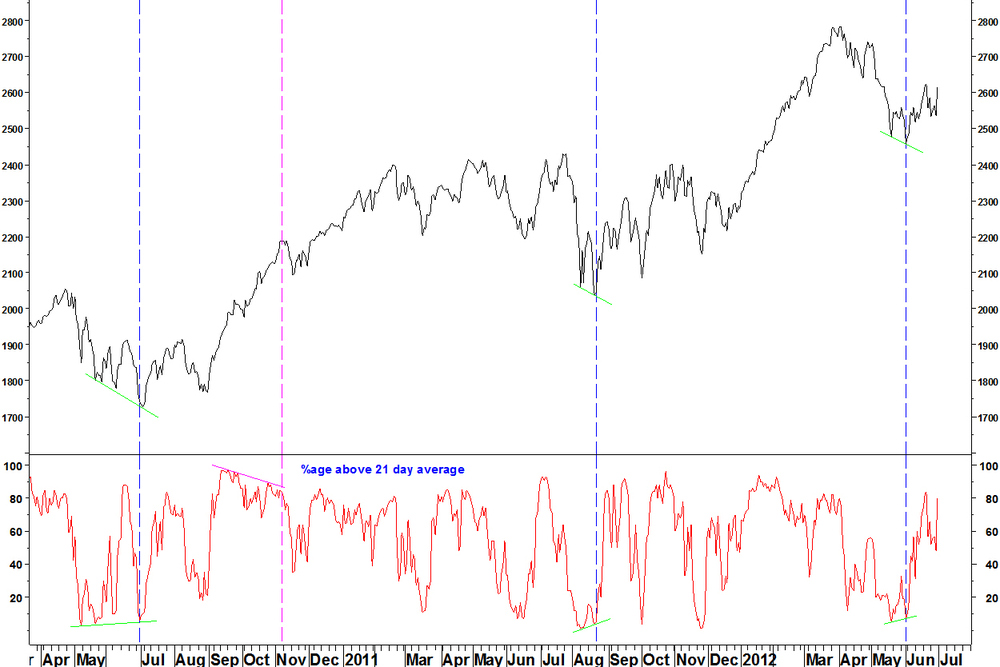
- The shorter term breadth indicator is better used for picking short term lows through divergences, whilst the indicator is at the bottom of the range. Three such examples are shown: July 2010, August 2011 and early June 2012
- Context from the longer term breadth indicators is needed but even in the 2008 crash, this tactic works reasonably
- This indictor works less well for picking tops. Much of autumn 2010 is spent on a divergence but the index continues higher. The November setback is shallow as the longer term breadth indicators are not on divergences
S&P 500 Index and %age above 50 day average
The idea of an indicator showing the same thing over different market segments was useful at the October 2011 low.

- The S&P 500 Index formed a low with a bullish divergence on the 50 period breadth indicator
- There were also divergences for the S&P 100 Index and S&P 400 Index (mega and mid cap indices)
- Divergences in spring 2012 took a long time to play out, as the longer period indicators were not overbought and divergent
Summary
- Divergences are the best situation for picking turns, the more marked the better but they don’t come around that often
- High breadth is no guarantee of a peak and low breadth is no guarantee of a trough
- Short period moving average breadth indicators are more useful at lows than at highs
- These indicators are to be used in conjunction with other ideas, particularly RSI divergences
