This obscure sounding group of stocks is one of the 24 S&P Industry groups within their Global Industry Classification Standard (GICS). It sits within the Industrials sector (there are 10 GICS sectors).
Stocks within this group can be found on http://money.cnn.com/data/sectors/commercial_services/
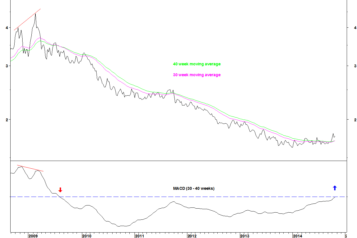
S&P Comm & Prof Svs Index vs. S&P 500 Index
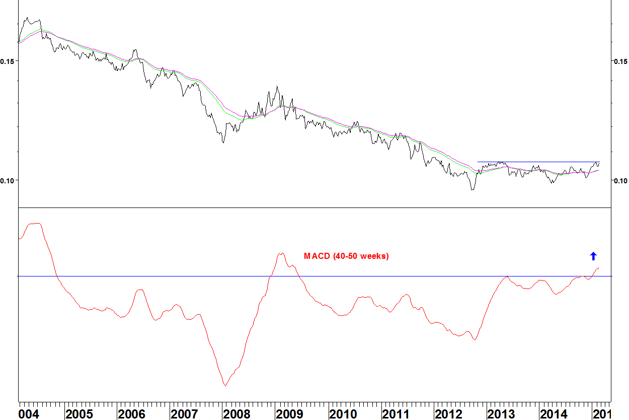
- The MACD has crossed above zero for the first time since June 2009, fitting the criteria of looking for moving averages that have not crossed for over four years
- There is also a bullish divergence on the MACD (this was not the case for the 2008 crossover that failed to hold)
- The ratio is testing the top of a base that has formed since late 2012
Here is the sector against some of the other S&P Industries.
S&P Comm & Prof Svs Index vs. S&P Software Index

The moving averages have crossed for the first time since early 2009, with a potential base having formed since early 2012
S&P Comm & Prof Svs Index vs. S&P Media Index

- There has been a downtrend since early 2009
- In late January, the ratio made an 18 month high but has since pulled back into the base
- The MACD has not yet crossed
I’ll have to leave finding stock candidates today. There does seem to be some overlap with the media sector in the money.cnn lists.
I have started a CFA course on the advice of several people. Whilst I have shown what I can do on this blog, have enjoyed writing it and learnt from it, I haven’t yet been able to translate that into employment. Networking is hard, much harder than analysis or trading.
I’ll be doing that on 11 Saturdays in the first half of this year with an exam in June. The idea is that Mondays are now mainly spent going over that material. I hope to find time for the occasional blog but they will be less frequent.
There has been a rash of articles recently saying that because the oil price has fallen, this is bullish for airlines.
There are two ways of looking at this.
A) you could expect to see oil falling as good for airlines, having an immediate effect each time the oil price moves
B) you could expect a longer lag, that once the oil price has fallen by a sizeable amount, that leads to positive performance
I am used to thinking the first way because I take a technical approach, whereas a fundamental analyst might see things the second way.
Let’s examine the evidence, showing the historical relationship between the S&P 500 Airlines Index and the oil price
S&P 500 Airlines Index and oil

The chart is split into periods, picking out a turn in either the sector index or oil.
- Whilst the end of this sector rally has coincided with a falling oil price, much of the rally since late 2012 (blue arrow) occurred with a rising oil price
- During the period of early 2007 to mid 2008, the oil price rose but the airline index first fell but then rallied
- The sector fell along with a falling oil price in 2001 due to the terrorism threat but also the effect that had on broader stock market sentiment
- The sector fell with oil in 2008 during the market crash. Again the market environment was much more important than the price of oil
Conclusion
There has not been a consistent correlation between the oil price and the S&P 500 Airlines Index over the last 15 years. This is the case whether you expect the stocks to react immediately (technical method) or with a delay (fundamental method).
What about if the effect of the broad market is stripped out? Next I show the relative strength of the sector against the S&P 500 Index.
S&P 500 Airlines Index versus S&P 500 Index and oil

- At the start of 2002, airlines had the fundamental benefit of cheap oil but they underperformed right up to the end of 2007
- At the start of 2008, airlines started to outperform, even though oil continued to go higher
- Within the longer period of underperformance, there are periods of inconsistency: from mid 2005 to early 2007, oil rallied then fell and the relative strength of airline stocks rallied then fell
- Airline stocks have outperformed since late 2012 but only since summer 2014 has this been in a period when the oil price was falling
Conclusion
Whilst at times a low oil price leads to a period of positive performance, the long period from early 2002 (when the oil price made a low) to 2008 does not support this argument.
Other factors such as what is happening with other sectors, broad market sentiment and market shocks are more important.
The US Dollar has rallied strongly over the last few months but the Dollar Index now has bearish divergence on its 14 week RSI.
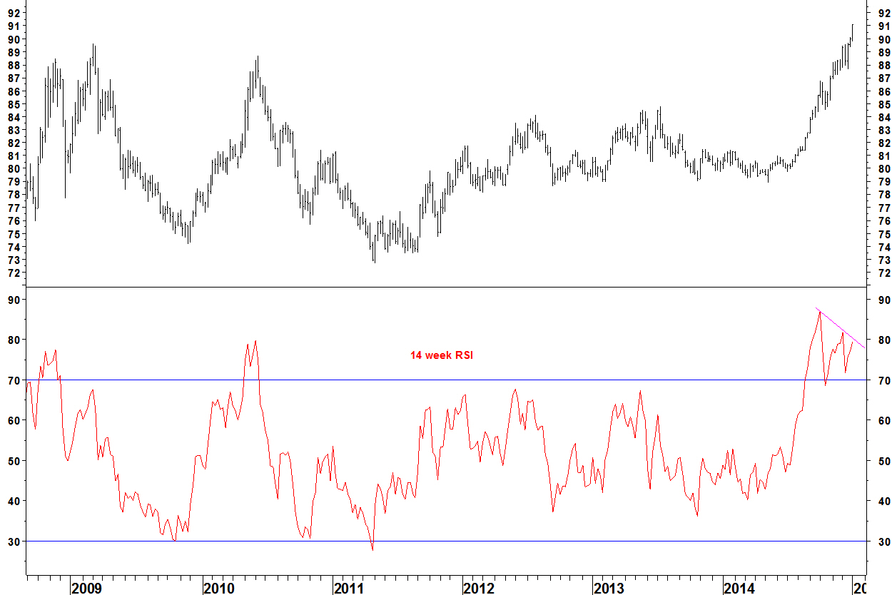
We can expect a consolidation of this advance to begin soon. Long term though, the US Dollar may have made an important low. There have been some long term moving average crossovers for the US Dollar against some currencies.
US Dollar vs. Swiss Franc

- The 60 and 130 week moving averages last crossed in July 2002 but there has just been a bullish crossover
- There is plenty of upside in the long term back to the 2002 level
- Price will likely pull back into the moving averages before resuming the advance
US Dollar vs. Singapore Dollar

- The 60 and 130 week moving averages last crossed in May 2003 but there has just been a bullish crossover
- Just as with the Swiss Franc, there is plenty of long term upside but price will likely pull back into the moving averages before resuming the advance
I got sent this web analytics report on my blog for 2014. I work in web analytics, so it is nice to be referred to as a ‘helper monkey’, thanks WordPress.
Self promotion is something I am struggling with, I need to find new ways of contacting people and engaging them my ideas. What this blog (at almost three years old) does is show:
- a positive track record of recommendations
- a set of ideas that stand the test of time – they don’t just work at a given time in a given market environment
- an ability to present my ideas clearly to all levels of audience
I’ll continue to plug away at finding good people to work with in 2015, get in touch if that could be you.
__________________________________________________
The WordPress.com stats helper monkeys prepared a 2014 annual report for this blog.

Here’s an excerpt:
A San Francisco cable car holds 60 people. This blog was viewed about 1,800 times in 2014. If it were a cable car, it would take about 30 trips to carry that many people.
One month ago, I showed the potential for relative strength for the S&P Health Care Equipment & Supplies Index. Here is an update.
S&P Health Care Equipment & Supplies Index versus S&P Media Index
- This chart was shown after the first move above the base at A
- The moving average crossover occurred in early November
- A bearish divergence was formed on the 14 day RSI and another one could form on a new high
- Underperformance by the media sector has contributed to the progress as much as health care outperformance
- Due to the divergence, there is likely to be a period of consolidation towards the rising moving averages but the long term trend will remain up
I showed Medtronic as an example from the sector
Medtronic (MDT) v S&P 500 Index

MDT has continued higher against the S&P 500 Index
I showed two Bollinger Band breakout set ups using MDT.
MDT v GameStop Corp (GME)
- There has been a decisive break higher following a 13% fall for GME on Friday
- This should continue higher in the medium term but a meaningful stop loss (below the moving average) is a long way away now
- The sharp move higher in January 2014 was the end of the move for almost a whole year
I will pass up on this trade now
Update on Kellogg (K) v Disney (DIS)

- This trade made a positive start last week and shows a 2.5% gain
- The stop loss is moved to the break even level of 0.720496
I have been on the look out for stock pairs and the first one that has triggered is a defensive trade: Kellogg (K) v Disney (DIS).
Kellogg (K) v Disney (DIS) daily chart
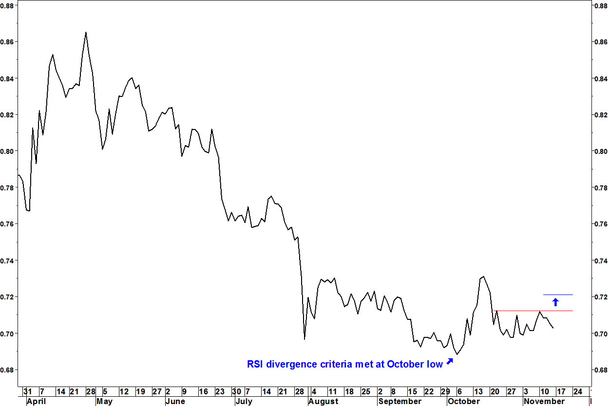
- This fitted my RSI divergence criteria at the early October low
- The pair rallied to the mid October market index low, as you would expect for a defensive pair
- The pull back lasted until 21 October. Since then, it has gone sideways despite the market indices rallying
- Today, it rallied decisively above its four week range
- I open a long position in K v DIS in real life and in the trading ledger for this blog. The stop loss is below the low of the last four weeks
Wednesday update
The closing prices on Monday were $65.14 for Kellogg and $90.41 for Disney, giving an entry at 0.720496. The stop loss is below the October low of 0.697755.
The ratio is already above the mid October peak.
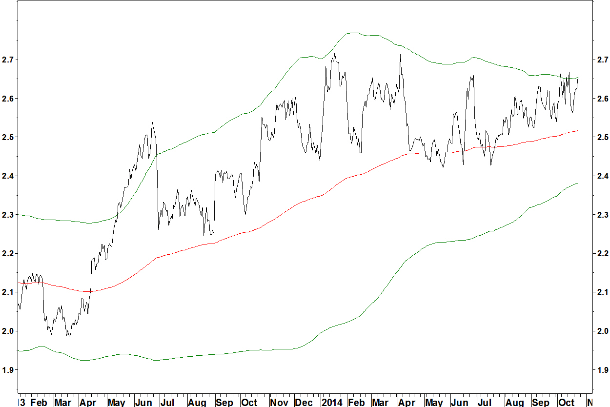
In the days before the mid October low for the S&P 500 Index, small caps strongly outperformed large caps. Here, I look at the track record of the small cap versus large cap ratio.
Russell 2000 Index versus S&P 500 Index

- On October 10, the ratio forms a bullish divergence on its 14 day RSI and rallies strongly from there before the 15 October index low
- On July 25, there was a bullish divergence that led to a ratio rally but unlike other times, the market dropped
- On April 15 2013, there was a bullish divergence, leading to continuation of the long term ratio and index uptrend
Behaviour at earlier index lows
- October 2011: Ratio and SPX bottom simultaneously. Ratio has bullish RSI divergence
- August 2010: Ratio starts rallying on August 24, SPX rallies on September 01. Early warning, no ratio RSI divergence
- March 2009: Ratio and SPX bottom simultaneously. No ratio RSI divergence
January 2008: Ratio bottoms on January 11, SPX rallies on January 23. Early warning of brief rally - June 2006: SPX low on June 13, falling again on June 20 but with ratio forming bullish divergence. Index low holds
- April 2005: SPX low on April 20, falling again on April 29 but with ratio forming bullish divergence. Index low holds
In summary
- October 2014 was the clearest case of the ratio leading the market, August 2010 was another example
- The October 2014 ratio rally was predicted by the divergence, as were others regardless of whether the index was at a low
Since the indices made their lows on 15 October, the rally has mainly seen most defensive sectors (consumer staples, utilities, telecom) underperform, as would be expected. The one exception is the health care sector, which has outperformed the S&P 500 Index.
Medtronic (MDT) v S&P 500 Index

- MDT has broken resistance against the S&P 500 Index
- The pair broke resistance on the market decline up to 14 October. Although MDT underperformed in the next few days, it recovered most of this and I expect the breakout to hold
- This break higher is not one of my defined patterns that I look for. It is not specific enough
There are 68 S&P industry categories. Here is a pending long term moving average crossover of a pair made from two of them.
S&P Health Care Equipment & Supplies Index versus S&P Media Index
- In my long term moving average crossover method, I look for charts without a crossover for four years. The 30 and 40 week moving averages last crossed in August 2009
- There is a long term bullish divergence on the MACD (this is percentage difference based, it isn’t in place because the pair has fallen and the numbers are getting smaller – it would exist if the pair were inverted)
- The pair has broken above the base formed since September 2013
As I have discussed previously, these crossovers don’t give the timing of when the chart will move, it could go sideways for months. My Bollinger Band breakout method is better for finding charts about to move.
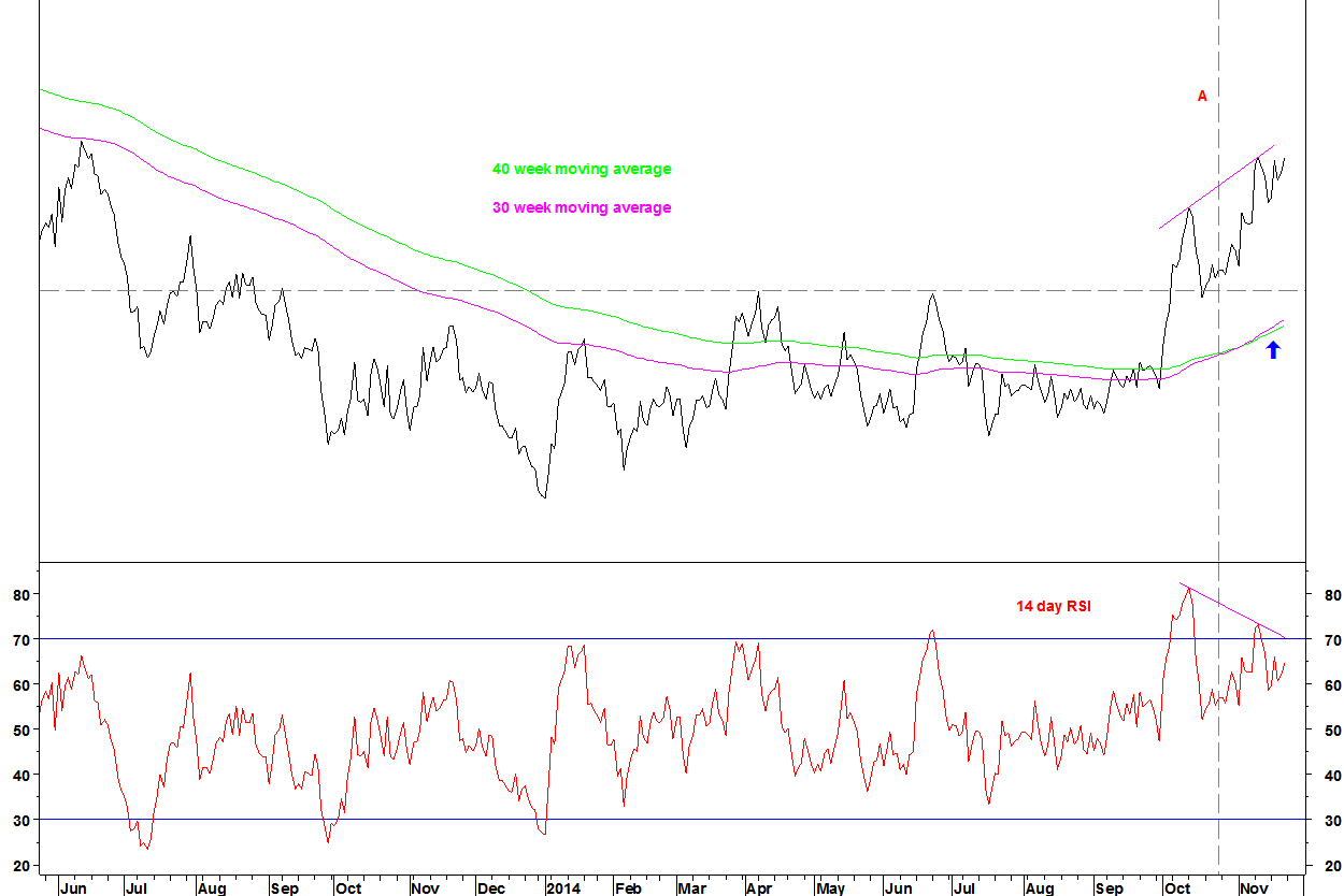
Medtronic (MDT) v Shaw Communications (SJR)
SJR is a stock from the Media sector that gives us a pair fitting my Bollinger Band breakout trade criteria.

- After the consolidation since January 2014, the 50 week Bollinger Bands are at their tightest in over 3 years
- The 14 week RSI is mid range
- There is a base and a first step above it, so the 50 week moving average has an identifiable direction. I look for breaks in the direction of the moving average
- There is scope for reversion after the multi year downtrend
The entry signal is an expansion of the bands and a close beyond the band on an end of week basis.
Daily chart
This is the same bands on a daily chart. That price has remained near the upper band during October rather than pulling back sharply from it as before, suggesting a break higher is imminent.
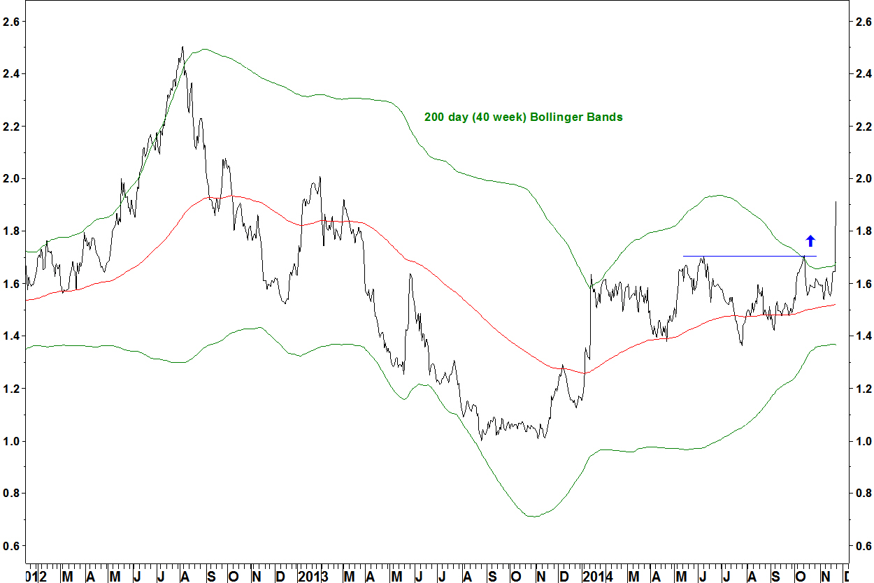
MDT v GameStop Corp (GME)
The sell side on this pair is from the consumer discretionary sector.

- This daily chart shows 200 day (40 week) Bollinger Bands
- The buy signal is an expansion of the bands and an end of week close above the upper band
- This should also entail resistance in blue being broken
Summary
- Medtronic has broken resistance against the S&P 500 Index
- There is a pending long term moving average crossover on the pair chart of the Health Care Equipment & Supplies sector vs. the Media sector
- Medtronic is poised for Bollinger Band breakouts against Shaw Communications (SJR) and GameStop Corp (GME)
- Watch for these band breaks then trade accordingly, re-balance sector allocations, understand the defensive nature of these rotations
The position in WalMart (WMT) against NASDAQ 100 Trust (QQQ) was closed for a profit of 4.1%. This was posted on 15 October.
In early September, I updated the stop loss on my trade in Vornado Realty Trust (VNO) against iShares U.S. Real Estate (IYR). This trade has now been stopped out. It didn’t follow through on its set up but through taking half and moving the stop loss to break even, a small gain was made, maybe enough to cover dealing costs.
The remaining half was stopped out at the entry level of 1.46307 on 17 October. With a gain of 1.2% on the first half portion of the trade, total gain was 0.6%.
Vornado Realty Trust (VNO) v IYR

The trade was entered at A, halved with the stop to break even at B, stopped out at C. At X, there was a bullish RSI divergence, albeit with RSI slightly above 30 but this shows again that these divergences work. Whilst the trade hadn’t made anything, the weekly RSI and MACD divergence set up remains in place.
Update on Washington Real Estate (WRE)
This is a slow burner, I last updated this chart in the early September posting (above). WRE against iShares U.S. Real Estate (IYR) continues to develop its base. This pair is inversely correlated with the broad market (WRE is a defensive stock).
WRE v IYR daily chart

Between the red arrow (23 September) and the blue arrow (15 October), the broad market fell and WRE outperformed IYR.
I’m expecting this base to continue to build, the moving averages to cross and an uptrend to emerge but these long term moving average crossover charts do not give the timing. For that we need other tools.
